Like most business travellers we appreciate good airport design.
We see plenty of the same sprawling low-slung slabs, so when someone conjures up a truly stunning airport – even if it's in an airport from the 1960s, as is the case with New York's TWA Terminal – well, we can't wait to check it out.
So following on from Kuwait's amazing 'mega-hub' airport and Richard Branson's Virgin Galactic Spaceport, here's the latest airport to send a quiver through our bag tags.
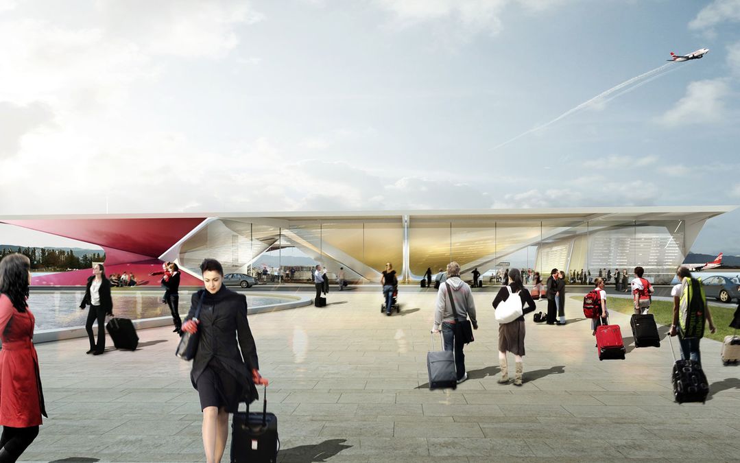
It's the new Kutaisi Airport for Georgia (the Eurasian country, not the American state), created by Amsterdam-based UNStudio.
The terminal building divides arrivals and departures on a single level, instead the more familiar two-storey approach, so the split shape ensures that departure and arrival flows do not coincide.
The most eye-catching aspect is the arrival and departure information projected onto the terminal's massive transparent walls.
Forget about searching for and then crowding around a monitor: just glance up at the wall of the bulding and there's the info you want, cast metres high!
UNStudio has also gone a little out there with the air traffic control tower. The exterior of the twisty tower is clad with a transparent skin with the potential to change color whenever there is a fluctuation in traffic.


Qantas - Qantas Frequent Flyer
18 May 2011
Total posts 233
Am I mistaken or does it have no jet bridges?
24 Oct 2010
Total posts 2561
You're not mistaken – it's all ground level, tarmac access and ramp stairs!
Hi Guest, join in the discussion on PHOTOS: Georgia's futuristic Kutaisi Airport terminal