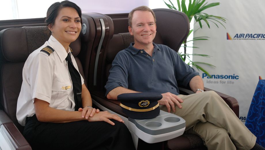
Upate: We've got first pics of the new Air Pacific 'Fiji Airways' Airbus A330, sporting new livery on the outside and new seats on the inside – click here for a full photo gallery!
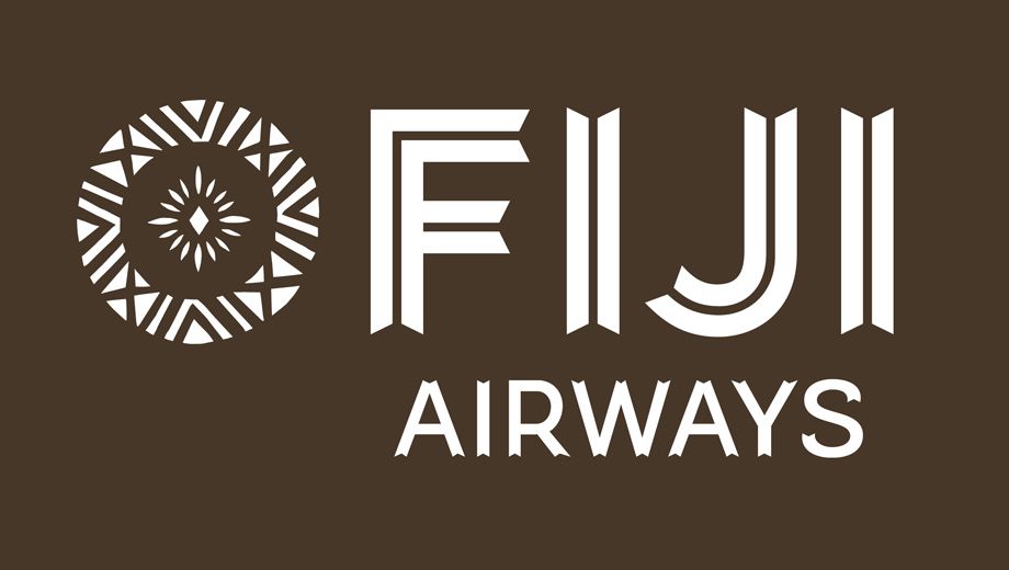
Previous: Air Pacific has revealed the new logo which will accompany the airline's rebranding as Fiji Airways – and it's a far cry from what you might have expected.
The tropical colours of Air Pacific have made way for a brown block with a stylised woodcut typeface and a unique 'Masi' symbol designed by Fijian artist Makereta Matemos.
For a quick comparison, here's the current Air Pacific logo:
The new logo will be incorporated into the livery of Air Pacific's three new Airbus A330-200 aircraft due in March, May and November 2013.
These are the first new widebody aircraft ever purchased by the airline and will fly from Fiji to Australia, Auckland, Hong Kong and Los Angeles.
They'll also be equipped with new business class seats.

The full livery will be revealed on October 10th this year in conjunction with Fiji Day, the celebration of Fiji’s independence day.
The Fiji Airways name marks a return to the airline's original title from 1958 and 1970, which Air Pacific CEO and Managing Director David Pflieger says will see the airline more closely aligned with its Fijian heritage.
"While the new name had a lot of history associated with it, we decided that we wanted a new and distinctly Fijian symbol and brandmark that would help us best represent the country while also ensuring our planes stand out at some of the world’s busiest international airports."
What's your take on the new Fiji Aiways logo, and will it catch your eye (in a good way) at the airport?


17 Aug 2012
Total posts 4
I absolutely love it. Such a distinctive brand. Interested to see how it works on metal.
Qantas - Qantas Frequent Flyer
17 Jan 2012
Total posts 172
I hope they come up with a more interesting livery than their current scheme.
Qantas - Qantas Frequent Flyer
09 May 2011
Total posts 362
I hate it
Virgin Australia - Velocity Rewards
23 May 2012
Total posts 268
It looks great! It definitely is an upgarde from its previous logo. It symbolises Fiji reallyt well and it is very interesting to see the design. My team was a little worried when we thing of how it would look on an aeroplane. We don't want to see it covered in brown.
04 Nov 2010
Total posts 670
Aero-seat, I think they will follow the Virgin route and go for a mostly white plane, with the tail using this brown block treatment, and maybe the block on the fuselage or perhaps it will be reversed, with the lettering and logo in brown instead of where its now white.
Qantas - Qantas Frequent Flyer
20 Mar 2012
Total posts 233
I think it's fantastic. Air Pacific look like they are re-shaping from a typical tourist destination carrier to a more business-orientated airline. Look at the colour palette they have chosen, very business-like, sleek and simple but till formal, with the introduction of the Weber seats and Panasonic Avionics it seems Air Pacific have caught back up to other carriers. I can imagine the differance it will make to the frequent traveller's to Fiji, especially those in the now- 'Tabua Class'.
04 Nov 2010
Total posts 670
Really looks good, count me as a fan. The old Air Pacific logo and colours looked, well, 'old', almost 80s or 90s. This looks very modern despite it being 'traditional'.
Hi Guest, join in the discussion on Air Pacific reveals new Fiji Airways logo