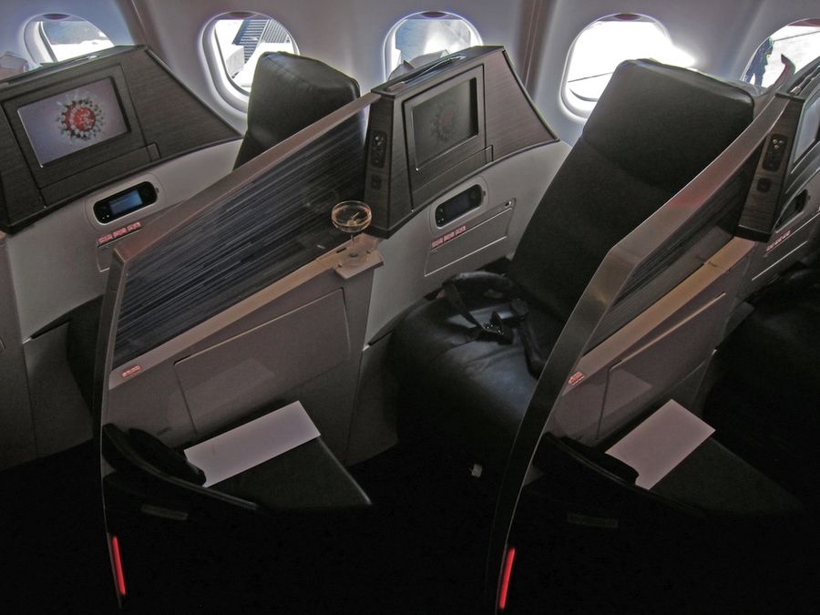
Having reviewed Virgin Atlantic's new Upper Class Dream Suite business class on one of its first flights, we'd normally leave things there, with a qualified "it's an improvement" on just about every category.
But there was such interest in our review of the new seat that we decided I should take you on a detailed journey around the seat and the cabin. Think of this as the advanced version of our review, aimed at the most seasoned traveller trying to decide whether to pick this seat over the older versions.
Oh -- and all of these pictures are real-life -- no PR-polished, fisheye lens-enhanced Photoshop trickery here. This is what you'll find on the plane, pure and simple.
So top up your cuppa and join me for a deep dive into Virgin Atlantic's new Upper Class Dream Suite.
We'll take a tour through:
- the new Upper Class cabin
- seat width, length and stats
- "fold over forwards" style retained
- revolutionary seat structure
- lack of storage space
- at-seat technology and power
The new Upper Class cabin
You'll find 33 of the new Upper Class Dream Suites on board Virgin Atlantic's Airbus A330-300 planes.
At the front and back of the cabin itself are wavy bulkhead walls with lines of Swarovski crystals. I was expecting mega-bling, but it's actually seriously sedate.
Through the curtains at the front of the cabin you'll find the main galley kitchen that serves Upper Class and one of the three Upper Class lavatories.
At the back of the cabin is the revamped, angled bar area, which has seating for three, perches on a wall for another two, and enough lounging around space for a further eight or so people.
Seat width, length and stats
Let's get the stats out of the way first, courtesy of threesixty aviation, the seat's manufacturers, who are themselves owned by Virgin Atlantic.
The new Upper Class Dream Suite is 22.8 inches wide in seat mode, with an extra 1.8 inches found when the seat converts to bed mode, which is 24.4 inches wide.
The outboard (window) seats measure 87 inches (221cm or seven feet, three inches) in length from point to point, while the inboard (centre) seats are 80.5 inches (204.5cm or six feet, eight and a half inches) long.
In the outboard seats, the "usable length" is quoted as 78.5 inches, which is just over 199cm or six feet, six and a half inches.
The new design of the seat means that you gain length, but a fair bit of it is taken up by the head and tail of the bed tapering to a point. That makes what I reckon is about six inches of the official outboard bed length something of an advertising fib, despite some clever sculpting to make the best of it.
I'm six feet, two inches tall, and I was able to lie flat on my back or on my stomach in the outboard (window) seats. In the centre seats, no such luck -- I had to curl up on my side. It was still comfortable, but the take-home there is that if you're tall, you really want a window seat.
"Fold over forwards" style retained
The Dream Suite still folds over forwards to turn into a bed.
On the one hand, the fold-over style means that you get different levels of support for seat mode and bed mode. You're not sleeping on the same cushions used for sitting, in other words. And fully flat really does mean fully flat -- no cheating with nearly-fully-flat -- stretching the full length of your space.
On the other, seat mode doesn't really recline very far, and there's no legrest to turn into part of the bed.
Your only option for putting your feet up is to use the ottoman that's the foot part of the bed. And the old Upper Class seat was pretty hard -- frequent flyers used to be on the look for unused seats whose duvets and mattress pads they could pilfer to make the seat softer.
But if you hated the fold-over style before, there are a few updates that might change your mind.
Revolutionary seat structure
Instead of a hard base between the seat foam and the bed foam, the Dream Suite has a unique flexible structure, somewhat reminiscent of the stretchy slats you'd find on a poolside sun lounger so you get more "give" in the seat where you want it.
That allows a decent amount of "squash" (my highly technical term) when you press down on it.
The dividing walls have been raised in height a few inches (making things a little more private unless you're over six feet tall, in which case it feels about as private as it did before) and a goodly part of the dividing wall is now a translucent screen.
Virgin Atlantic's advertising says this is opaque, but it really isn't. It's translucent at best, but actually fairly transparent. You won't be able to see what the person next to you or across the aisle is typing, but you'll be able to see what they're doing.
I'm overall fairly positive about the translucent barriers. I like the spaciousness and the pattern looks very cool, but I wish it were slightly more frosted, just letting light through.
The other major change is the shape of the dividing walls, which are curved along every plane in a helix shape that very cleverly gives you a bit of extra space where you need it, carving that space out from your neighbour.
There are several issues of catches and fittings not working properly: on my return flight, the engineer on board had to be called to get the TV monitor to latch into place; the table wasn't flush against the wall when closed; the armrest took several goes to latch properly; I noticed several passengers having problems getting the seat release latches to convert the seat to bed mode or vice versa.
I also managed to kick a panel off the end of my ottoman when my foot slipped -- not a huge amount of force, really, and it added to the general teething issues with this first plane that should hopefully be fixed with the next build.
Lack of storage space
There's only one area where I asked myself "what were designers thinking?" -- storage.
With no overhead bins above the centre seats, you end up with two passengers having to share one of the small Airbus overhead bins, too small even for my undersized roll-aboard case to fit in wheels-first, and it only just fit in at all.
Business travellers travelling with a full-sized carry-on will be frustrated. And whenever this kind of shared-bin situation arises (as in some airlines' Boeing 747 nose business class cabins, where there's no overhead bins above the first few rows) there's always a petty tyrant who wants to know what you're doing putting your case in "his" bin.
Alternatively, see if the crew can fit it in the sizeable (but cluttered) closet at the very front of the cabin. The closet extends the whole way across the centre section, meaning you could probably fit two or three rollaboards in there, but it would be a nightmare to try to get them out during the flight.
Only a squashy-sided handbag that fits under the ottoman's angled legs was allowed to be underneath the ottoman at takeoff and landing.
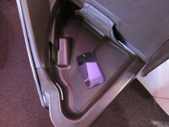
Nothing's allowed inside the small "wallet, phone, Kindle" storage compartment revealed when you lift up the ottoman seat at take-off and landing either.
In seat mode, you have a small flap under the ottoman where your noise-cancelling headphones are placed, a magazine slot next to the seat, and the tiny pocket dish next to your head.
Only the smallest laptop will fit into the magazine pocket, and not very easily either. My 11-inch MacBook Air ended up being a real squeeze to get out.
At-seat technology and power
You'll find a full power point underneath your seat, between your knees, which takes just about any type of plug (including UK and Australian models, which are sometimes tricky).
Bear in mind, though, that it's very close to the floor. My MacBook Air charger worked even with the smaller set of pins in, but only just. If your charger verges more towards the clunky "wall wart" style, you might want to bring the larger cable.
On my flight to New York, where roughly half the passengers were journalists trying to use laptops, the power point system fell over entirely and couldn't be resurrected. By the time of the return flight a day later, though, it was working again.
There are also two USB slots, the top one of which is for keeping your phone, e-reader or tablet charged (if it's not charging, try flicking the switch). These worked on both flights I took.
In terms of connectivity, you have:
- a USB slot for memory sticks
- a set of red-yellow-white RCA connectors that would do for your camcorder
- a round socket for connecting your iPhone/iPad/iPod
The first two are fairly self explanatory, but the third is a socket that requires a special cable to connect your device to the screen.
Controversially, Virgin Atlantic doesn't keep a stock of loaner cables on hand. Instead, the crew told me, you have to buy them from the inflight duty free trolley, and only two are available on each flight. Connectivity is a great idea, but this one lacks the execution business travellers expect.
Very sensibly, however, the fold-out cocktail table just below the connectivity panel is just about big enough to hold a phone or small tablet for when you're using it to watch something or just keeping it charged.
More on Virgin Atlantic's new seat tomorrow...
Tomorrow, we'll continue our deep dive into the new Upper Class Dream Suite with my thoughts as a traveller, having used the seat on the day flight from London to New York and on the red-eye night flight back.
For more Virgin Atlantic news and reviews from Australian Business Traveller, check out:
- Our extensive on-the-plane experience and review of the new Upper Class Dream Suite on board Virgin Atlantic's new A330s, loaded with real-world photos (and not just the glossy airline PR shots)
- Exclusive interview: Virgin Atlantic's Australia plans revealed: Upper Class Dream Suite and Boeing 787s are on the way
- The news from Steve Ridgway about Virgin Atlantic running UK, Europe, Russia and Middle East flights to replace BMI services
- AusBT's guides to the best seats in Premium Economy and in Upper Class (business) on the Airbus A340-600 planes Virgin Atlantic flies from Australia
- Virgin Atlantic's new whispering coach to reduce the noise in business class
For all the news, reviews and the very latest info for business travellers, follow us on Twitter: we're @AusBT.


Hi Guest, join in the discussion on In depth: Virgin Atlantic's new Upper Class Dream Suite