Exploring the new MoMA is all about the serendipity of surprise
A $580 million renovation and expansion adds room for visitors to breathe and to see more treasures from the permanent collection.
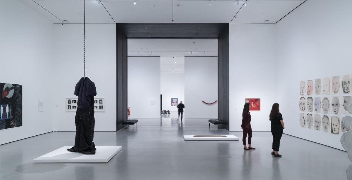
Walking through near-empty galleries of the expanded Museum of Modern Art in New York on its first day of press previews, I experienced serendipity at the MoMA for the first time ever.
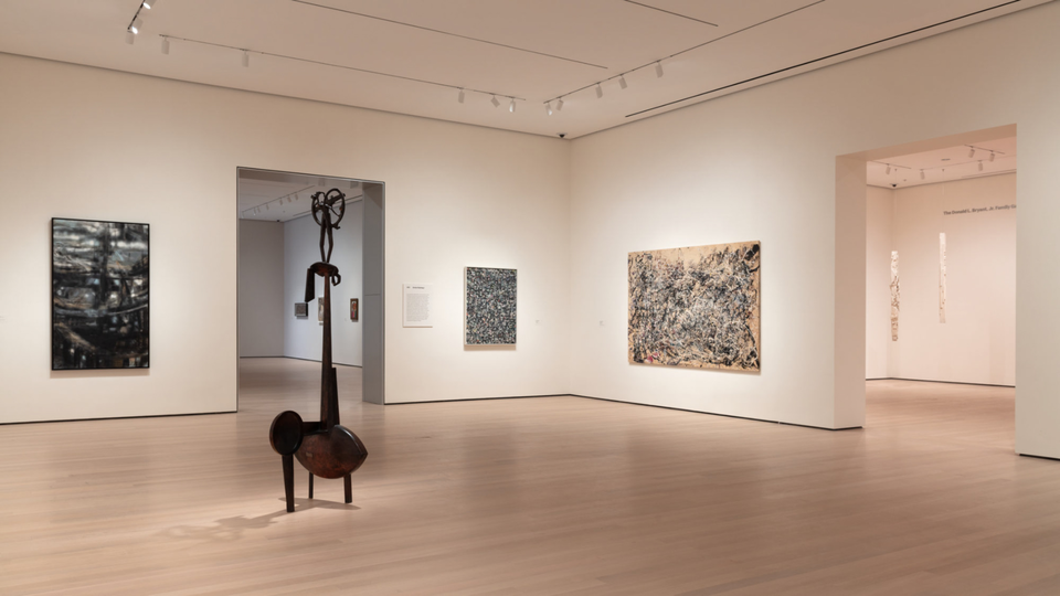
I turned a corner and stumbled across a vitrine with Meret Oppenheim’s fur cup from 1936 in front of Frida Kahlo’s Self Portrait with Cropped Hair from 1940; I walked to the left and was suddenly in front of Henri Matisse’s superstar work, Dance (I), from 1909.
It’s a combination of paintings, sculptures, and time periods that could never have existed in the old MoMA, where chronology and media were rigidly enforced. Visitors would walk from one gallery to the next as the museum’s slow, steady interpretation of modernist art history chugged onward.
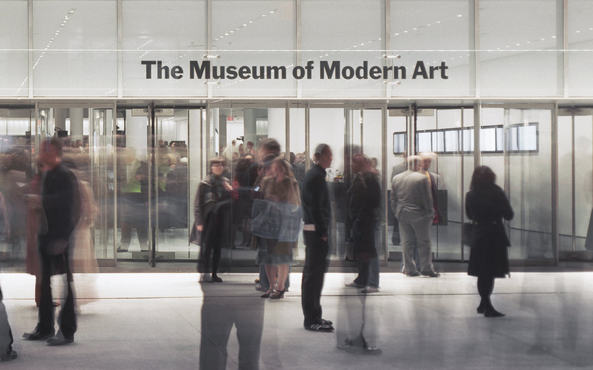
“We want gallery goers to move in different directions and to determine their own paths,” says Liz Diller, a partner in the architecture firm Diller Scofidio and Renfro, who, with the megafirm Gensler, designed the museum’s US$450 million renovation and expansion.
"The institution shouldn’t prescribe everything for you. I personally feel like having more agency, having an ability to interpret things myself and stop – go backwards or forwards – is a good thing.”
This sounds fairly simple to achieve: Don’t put galleries in a one-directional loop. Yet it eluded architect Yoshio Taniguchi in the 2004 extension of MoMA.
He created a visitor experience similar to being at a no-reservation Sunday brunch: you were either waiting for people to get out of the way or acutely aware that other people wanted you to do the same. Quiet contemplation was out of the question.
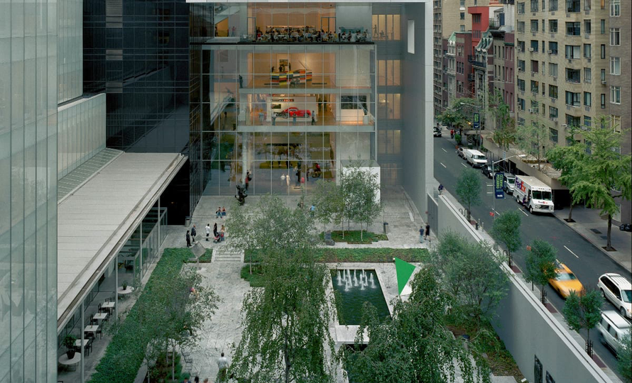
The 47,000-square-foot expansion has upended that assembly-line sensibility by pulling the focus – and visitor flow - away from what used to be the museum’s core; Diller says they opted to keep the addition’s ceiling heights the same as those in existing galleries in order to “expand all those spaces, and to not make it feel like an abrupt change,” she explains. Total gallery space after the expansion is 166,000 square feet.

The museum will officially reopen on October 21 with a permanent-collection-only show that encompasses the whole building.
Much has been made, by both curators and critics, of the fact that this is the first time that MoMA has upended a rigidly chronological approach to modernism, choosing instead to pair artworks based on aesthetic similarities (or dissonances), thematic parallels, or formal preoccupations.
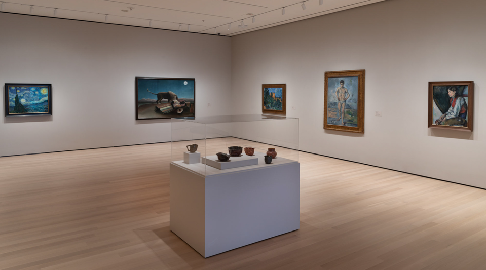
“These are not random juxtapositions, these are carefully thought-through conversations that we are trying to enable,” says Glenn Lowry, the museum’s director.
“Part of it is in order to arrive at a reasonable balance between the collection that’s in storage – about 200,000 works of art – and the collection that’s on display, which is roughly 2,500 works of art.”
For museum goers who either can’t find - or aren’t interested in finding - these conversations, wall text does a lot of the heavy lifting.
In the “Transfigurations” room on the second floor, the opening text informs us that “The works brought together in this gallery suggest a dialogue between artists across nations and generations who have reimagined how women might be represented.”
In the “In and Around Harlem” room on the fourth floor, readers will learn that “The fusion of art and politics defines these artists’ contributions to the traditions of figurative art in the twentieth century.”
And even though the text can occasionally get jargon-y (“Architectural projects were conceived of as interactions of variable components that would allow for change over time,” reads the text in the fourth floor’s Architecture Systems room), they’re largely useful and user-friendly.
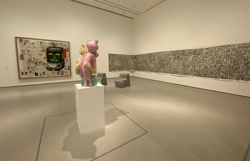
Close scrutiny of this new, hybrid approach to curation yields some sublime juxtapositions.
On the third floor, for instance, there’s a Lewis Hine photograph from 1908 titled Sadie Pfeifer, a Cotton Mill Spinner, Lancaster, South Carolina, which depicts a very young girl working in a factory; it’s hung next to dreamy 1895-6 painting by Édouard Vuillard of a bourgeoise woman in her living room, working on a lap loom. It’s not a subtle comparison, but it’s effective.
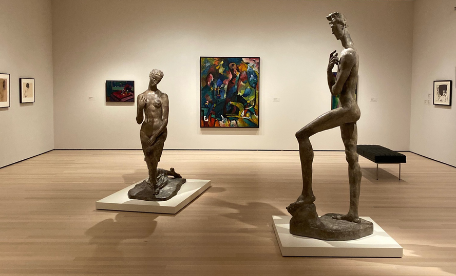
Or on the fifth floor in a gallery devoted to “new expressions in Germany and Austria,” two monumental stone figures from 1911 and 1913 by Wilhelm Lehmbruck are surrounded by portraits by Egon Schiele, Oskar Kokoschka, and Gustav Klimt.
Not only were these artists contemporaries, they collectively chose to elongate, and arguably, emaciate the human body. In the old museum layout, such an obvious and interesting combination of painting and prints and sculpture would be extremely rare.
Still, for all its successes, the museum’s strategy has more than a few stumbles. It turns out that putting two artworks in a room together does not guarantee “dialogue,” just as one person shouting in French and another person whispering in English is not, in fact, a conversation.
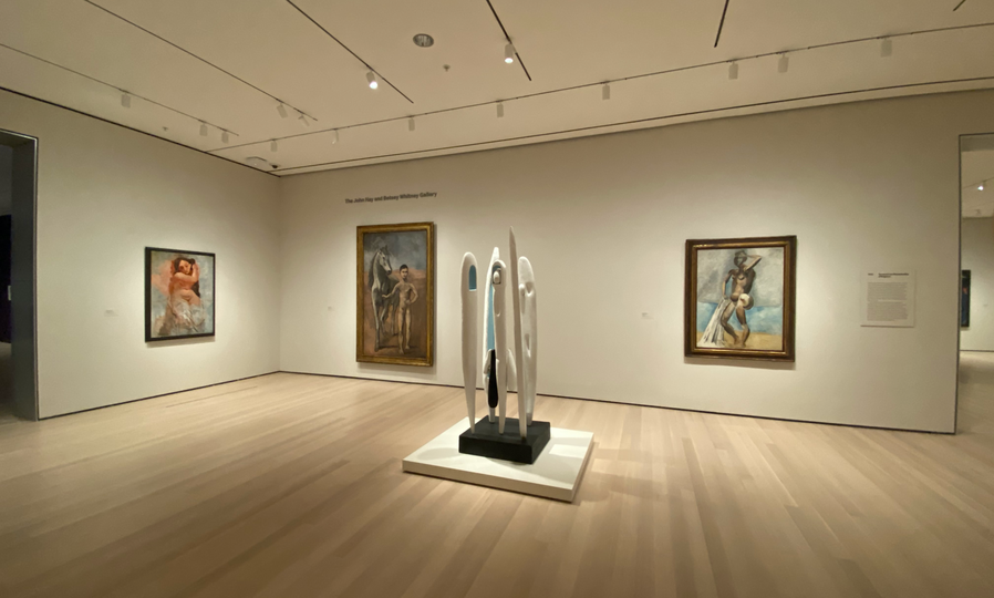
Take Picasso’s 1905-6 Boy Leading a Horse, one of the artist’s masterpieces and a cornerstone of the museum’s collection.
Why put Louise Bourgeois’s wooden cluster of abstract, painted totems Quarantania I, from almost a half-century later, next to it? The wall text doesn’t help. Rather than justify the sculpture’s presence, it stretches to associate the work with another Picasso, Les Demoiselles d’Avignon, which is on the far side of the room.
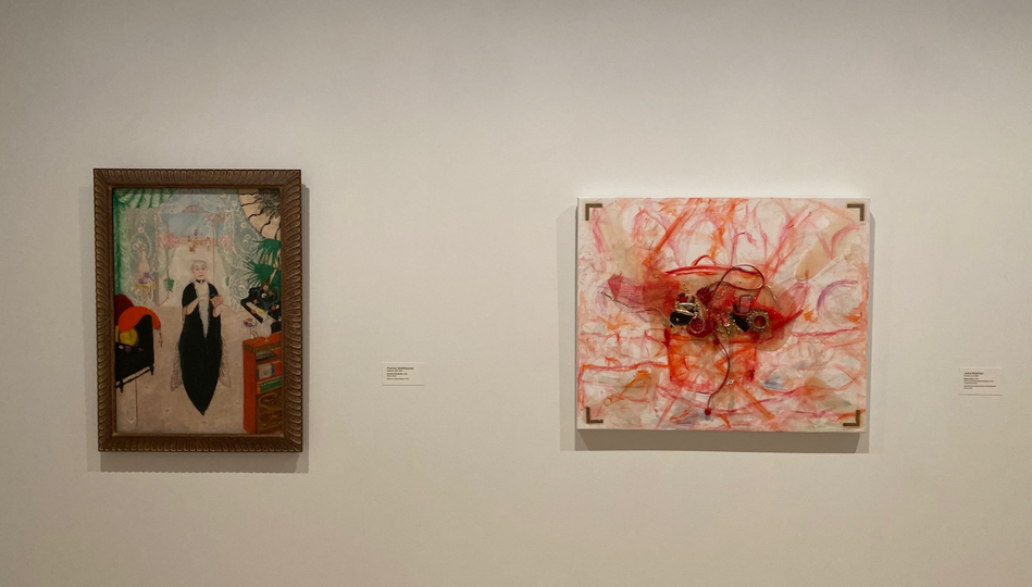
Similarly, the charming Portrait of My Mother from 1926 by the eccentric modernist Florine Stettheimer is paired with Bitches Brew, an abstract collage from 2010 by the young contemporary German artist Jutta Koether, presumably because one includes a woman in a dress, and the other includes deconstructed elements of fancy dress.
If that’s where their similarities end, the pairing isn’t as much a “conversation” as it is word association.
The good news is that the permanent collections will constantly be rehung – 30% of the objects will be changed every six months. It’s part, Lowry says, of the museum’s continual evolution.
“We’re about to be 90 years old, and we’ll have undergone nine major moves and expansions,” he says. “Every decade something changes, and that’s given us our DNA.”
Despite the exhibition’s flaws, the museum’s identity is clearer and more compelling than it’s been in decades. The expansion is a genuine step forward, rather than a mere augmentation of what’s already there. So what’s next?
“The only thing I know,” Lowry says, “is the 10th [expansion] won’t be me. Someone will come along and almost certainly say: ‘Whatever they did in 2019, we need to do something different in 2029.’”
