Keeping it simple: in watches, as in life, less is often more
Who needs bells and whistles when all you want is to tell the time.
When it comes to unfussy product design, there’s a quote from Apple’s Steve Jobs that gets to the point. “Simple can be harder than complex: you have to work hard to get your thinking clean and make it simple."
And while the appeal of this catchy mantra is easy to see, for watch designers, its lesson is a fraught one. That’s because much of the skill, value and cachet of a fine watch come quite literally from complication.
Complication, in the language of watches, has a very specific meaning: it's the term for any function on a watch beyond the telling of hours minutes and seconds.
Everything from the humble date, through to the popular chronograph and up to the most esoteric capabilities like marking the traverse of the zodiac through the sky is a complication. And while simplicity is still a prized quality in watchmaking, there’s always the tension between design and engineering between less is more and, well, more is more.
If you ever wanted a case study for the appeal of simple watch design, look no further than Daniel Wellington.
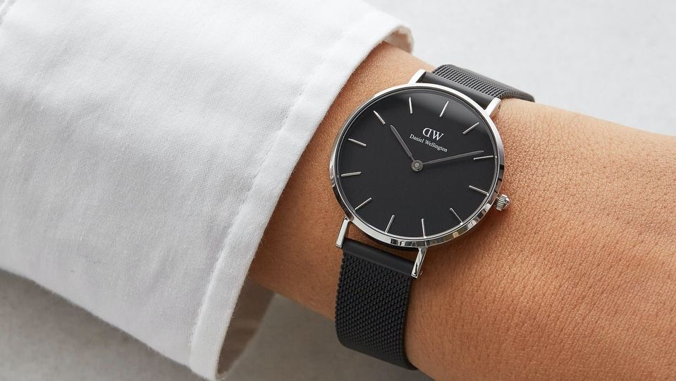
The brand, founded back in 2011, rapidly became incredibly popular, appearing on wrists all over the world. Daniel Wellington’s growth was built on two key pillars – a smart influencer marketing strategy, and the clean lines of the watches themselves.
Daniel Wellington watches relish in a clear, uncluttered visual identity: a quick scroll through the 55 watches currently on their site shows a lot of large, sparse dials, simple hands and markers and thin bezels.
There’s not a lot going on here, and for DW, that’s a good thing. Simplicity serves to keep costs down, but it also means that the watches are incredibly versatile, stylistically speaking. They offer a blank slate, worn by everyone from fashionable kids to their grandparents.
Of course, Daniel Wellington is playing a familiar tune, one written down, in large, by one of the most successful brands in the world: Rolex.
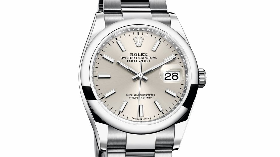
And while the green giant of Geneva certainly has its share of busy, complex watches, its core models – like the Datejust – are typically very simple in appearance.
A Datejust sitting in a boutique window today looks remarkably similar to the very first models from 1945. This continuity, along with the universal appeal are the hallmarks of Rolex’s success. They call them classics for a reason.
The sort of everyday casual dress watch epitomised (at very opposite ends of the price and quality spectrum, it must be added) by the Datejust and the Daniel Wellington is but one example of a watch where simplicity rules.
For the dress watch, this overall trope is one that fundamentally relates to fashion and the somewhat archaic rules of style. But there are other types of watches where the less-is-more aesthetic has more purposeful roots.
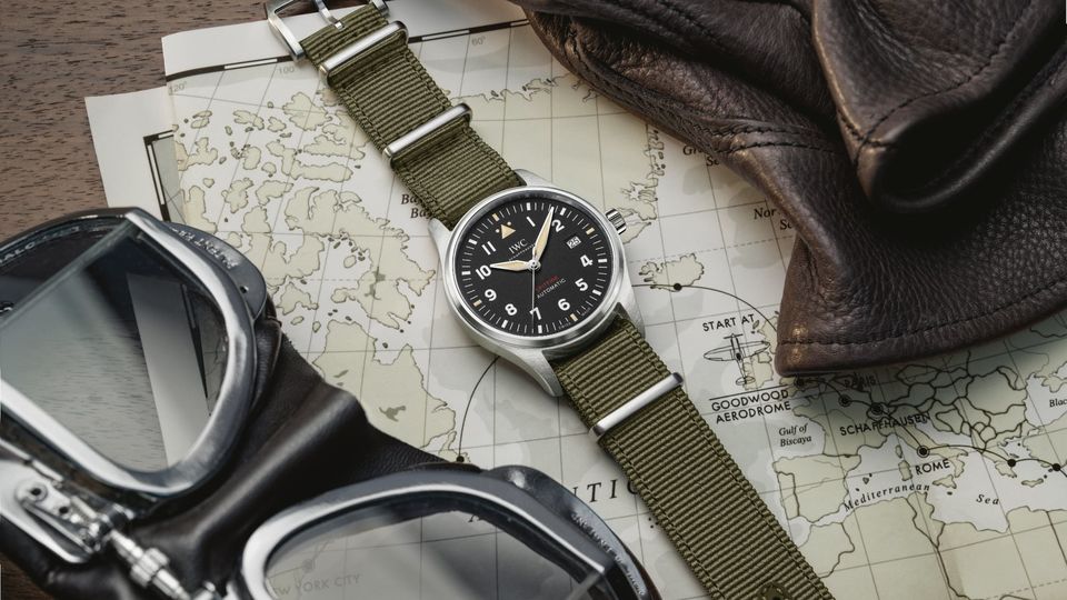
For example, the pilot watch began life as a tool for navigation, which in turn demanded high legibility. You could make an argument that the divers watch also fits this bill, but the functional necessities of rotating bezels and luminous markers, as well as the often-chunky cases, tend to detract from the clean lines.
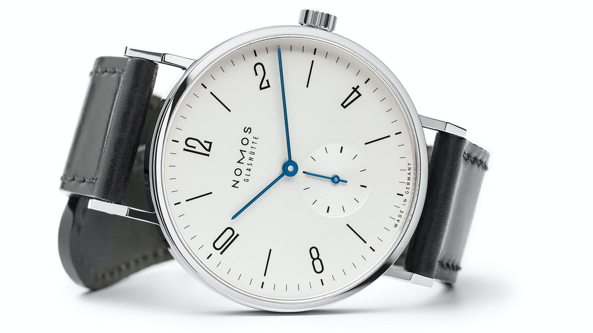
If all this talk of classic design has you thinking that simple equals boring, think again. Removing the clutter on a watch can help you focus on the funner things in life. Take, for example, the German brand Nomos.
Nomos is beloved by architects and other aesthetes, with has plenty of monochrome minimalism in its extensive catalogue.
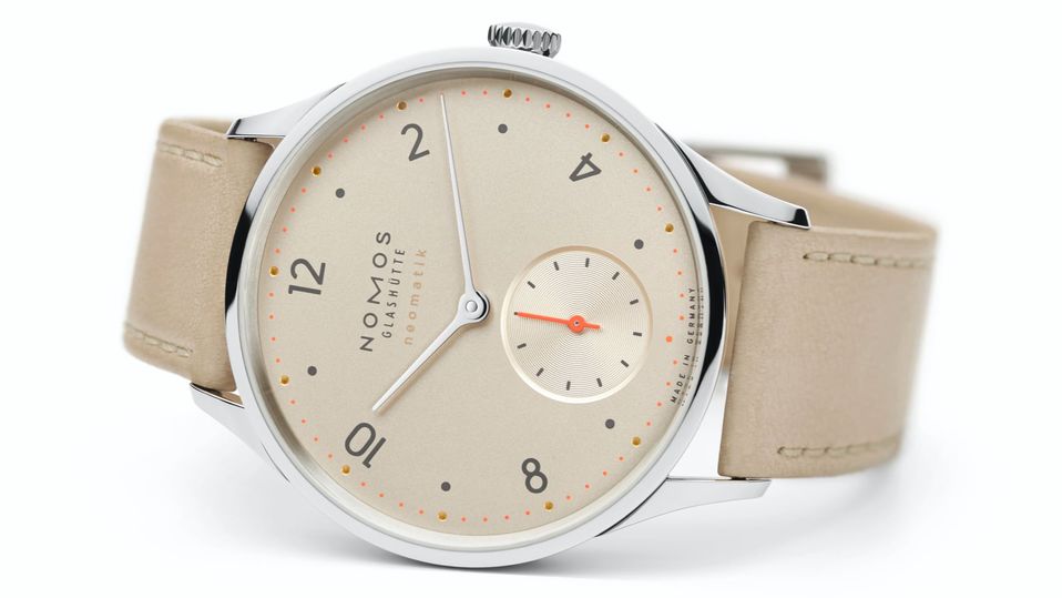
But many Nomos watches demonstrate that colour, when carefully applied, goes a long way. Take a look at the Minimatik.
Sure, the colour here is an elegant albeit unusual champagne, but aside from that, the Minimatik is a textbook example of well-designed simplicity. I’m willing to bet that you didn’t even notice that the seconds hand and minute markers were in traffic cone orange. Nothing stuffy about that.
The Minimatik is also a great example of another way simplicity matters, and that’s in the engineering.
The mechanical movement of this watch is, as far as these things go, very impressive. Built from the ground up, it’s efficient, streamlined design, which means it works very well is exceptionally thin.
The reason for this is because it doesn’t try to do it all – no bells, whistles or complications. And that’s something worth remembering if you’re in the market for a good watch.
Sure, you could get a watch that does it all, but on the mechanical side, the chances are that has been achieved by bolting more and more bits onto a base movement.
Or you could ditch the add-ons, and get a higher quality, more simple movement that does one thing (tells the time), and does it well. After all, isn't life already complicated enough?

American Airlines - AAdvantage
13 Jul 2015
Total posts 274
LOVE Nomos
Virgin Australia - Velocity Rewards
24 Jan 2018
Total posts 775
Still a big fan of the Raymond Weil Don Giovanni range. The Cosi Grande, with the row of diamonds, should be classified as a weapon.
01 Dec 2011
Total posts 34
I just looked at the price--more than I paid for a return airfare in J to Europe. So I won't be buying this watch.
Qantas - Qantas Frequent Flyer
25 Mar 2020
Total posts 4
I have a Brathwait, which I would have thought should have found a spot in this review, simple, elegant and timeless. They only sell over the internet. This is my third and I love it! I was tossing up between the Daniel Wellington and the Brathwait, but picked the later since they reckon that all the money that normally goes into marketing goes into the product with them. Who knows, it could even be true. But I'm happy.
PS I have no affiliation to Brathwait in the slightest.
Hi Guest, join in the discussion on Keeping it simple: in watches, as in life, less is often more