Photos: new look for Qantas Chairman's Lounge, Melbourne Airport

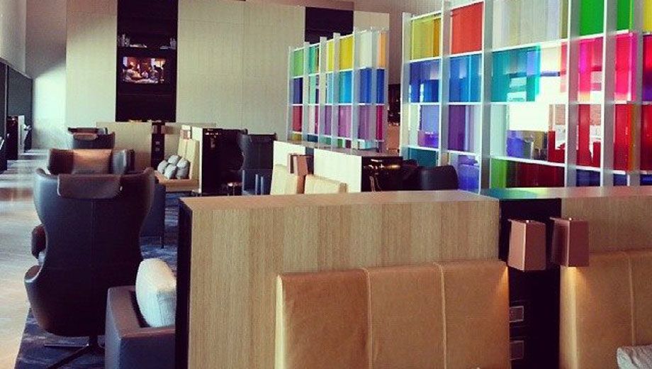
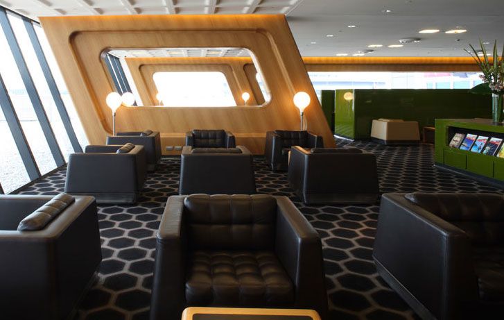
The invitation-only Qantas Chairman's Lounge at Melbourne Airport now sports a dramatic new look following extensive renovations behind those frosted glass doors.
The exclusive lounge is nothing like its Sydney counterpart, which shares much of its DNA with the highly-regarded Qantas International First Lounge.
Melbourne's new Qantas Chairman's Lounge darts off in a totally different direction.
We're certain this very colourful and very contemporary look will also prove very controversial, especially among more traditionally-minded members of the Chairman's Lounge program.
Gone are the muted colours and solid "gentleman's club" design.
Now it's light, open and airy, and rather more 'new European' rather than 'old London'.
Thankfully there's a well-stocked bar to help calm any overwhelming panic brought on by this dramatic change.
Visitors to Qantas' Sydney and Melbourne first class lounges will notice some familiar favourites on the menu, which is printed using the same placemat design as daily menus for the Qantas Singapore Lounge.
More photos: Inside the Qantas Chairman's Lounge
Follow Australian Business Traveller on Twitter: we're @AusBT


Virgin Australia - Velocity Rewards
25 Jul 2013
Total posts 72
I can't believe they would replace a beautifully detailed Marc Newson interior with this... it looks so cheap! Qantas has surely lost the plot.
Qantas - Qantas Frequent Flyer
01 Oct 2013
Total posts 92
First replacing the Skybed with something off the shelf, now this... I feel like the last people that had good taste in QF management were sacked in the last round of layoffs!
Qantas - Qantas Frequent Flyer
05 Feb 2013
Total posts 54
I'm not a great fan of the Marc Newson designs, but this new one looks as if its straight out of Ikea!
25 Sep 2013
Total posts 1242
I was just going to make the Ikea comparison. No, Ikea doesn't necessarily equal tacky but compared to the previous "private club" feel this is a far cry.
Ah well, not as if I'd ever see the inside of the lounge anyway. Moving on. :)
04 Nov 2010
Total posts 670
Yikes! This doesn't look at all 'exclusive' or 'refined' or antyhing else you'd expect from a VIP lounge. Yes it's 'contemporary relaxed' but it screams IKEA to me!
Qantas - Qantas Frequent Flyer
02 Jul 2011
Total posts 1374
Take out the coloured wall and it is very 'on trend' interior design wise with lots of light wood, dark hues, metallic light fittings.
Did the Melbourne CL ever have the Newson design, I thought it was much older (the other picks above are from Sydney)
22 Jul 2011
Total posts 95
Correct - only Sydney got the Marc Newson treatment and it was controversial - a lot of the pollies etc with zero design appreciation liked it. I think it's a shame. It was a bold call, but a complete success. Probably looks better in person, especially at night.
The Melbourne lounge is just meh.
15 Apr 2011
Total posts 580
I love how high the ceilings are, and most of the fittings and furniture actually look very nice. I can only assume that the coloured wall looks better in person than it does in the photos, given how tasteful Qantas' lounge design generally is.
It'll date quickly though, unlike what they have in Sydney.
VA
01 Mar 2013
Total posts 26
Perhaps this could be taken as a nod by qantas that not all corporate high fliers these days are male? I can see how a designer may have come up with this if they were asked to design a lounge that moved away from the "london gentleman's club" aesthetic and more toward a "refined scandinavian living room". If you remove the rainbow (IKEAesque or perhaps gay pride?) wall and replace it with something like the vertical timber feature in Alvaro Aalto's 1939 Villa Mairea, and replace some of the brand new chairs with vintage equivalents then I think it could be very a striking and inviting space.
28 Oct 2011
Total posts 645
it's time for QF to move away from the 'mancave' mindset and embrace a more up to date/contemporary/unisex design which reflects more of the actual members of the chairmans lounge...well done QF
09 Sep 2012
Total posts 139
By "male" do you mean men?
21 Apr 2012
Total posts 3006
Who says Ikea is tacky? It doesn't have the same testosterone punch as the SYD Chairman's Lounge but I think it is still quite nice...different but nice.
Shame the MEL Domestic Business is still in its current tattered state.
28 Oct 2011
Total posts 645
i agree!!! well said
Qantas - Qantas Frequent Flyer
05 Feb 2013
Total posts 54
The Marc Newsom design is dark, very masculine, and clubby. I welcome a brighter, lighter design. The seating area in the new design looks good, but the dining area just shouts Ikea to me.
Did anyone say Ikea is tacky? I don't have a problem with Ikea furniture; I have Ikea furniture in my living room. However, in a airport lounge I prefer a layout that looks as if it is the result of meticulous design, exceptional materials and generous proportions. I'd prefer that it doesn't look and feel like an Ikea showroom, nor like my living room.
21 Apr 2012
Total posts 3006
MartinS,
You've hit it on the head! Maybe the look they're going for is someone's living room!
Qantas - Qantas Frequent Flyer
04 Oct 2012
Total posts 149
I don't mind it. I have mixed minds about the coloured wall, but it's growing on me. Honestly, look at it 2-3 times, it actually fits in well. I like that they have gone for a more homely feel, such as a living room, which is infuzed with a very cafe/small restaurant feel. It is definitely very "melbourne".
Qantas - Qantas Frequent Flyer
04 Oct 2012
Total posts 149
Does anyone know where they get the small dining tables and chairs from? I really want some!
28 Oct 2011
Total posts 645
going by the various comments on here...IKEA!! because apparently ONLY IKEA makes/supplies this type of furniture....i admit i dont know where/who supplies them....but im willing be bet they are NOT from IKEA....and are of a far better quality...maybe even made in OZ with OZ sourced materials... shock/horror!!....and yes also very 'melbourne' ... that's a compliment..not a criticizm
15 Apr 2011
Total posts 580
Indeed, some commenters here would do well to go and have a wander around some high end furniture shops and realise that this look is very in right now, and it's very different to the chunky chipboard flat pack stuff that you get at Ikea. I have nothing against Ikea, but I doubt anybody would be making the comparison if they saw the furniture in person and realised how much quality and finish impacts the feel of the space.
28 Oct 2011
Total posts 645
let me also add...i have nothing against IKEA..i have acquired many 'allen keys' over the years!! and am happy to report all of my purchases have survived what i have inflicted on them...lol
Qantas - Qantas Frequent Flyer
05 Feb 2013
Total posts 54
I too am sure they are not from Ikea. But as you say "IKEA makes/supplies this type of furniture".
The dining area looks cramped and overly busy to me. Like an Ikea showroom, or a Docklands cafe if you prefer. Great for creating a bit of buzz in a cafe, and I'd be quite happy to grab lunch or a coffee in such a setting. Personally, I prefer an airport lounge to be an oasis of calm, but each to his/her own.
28 Oct 2011
Total posts 645
let's not forget....this is the Chairman's Lounge..and will hardly be overcrowded by the 'masses' ..even in the dining area... i'm sure the dining space will be able to accommodate its clientelle quite comfortably
17 Feb 2012
Total posts 121
Love it... With most lounges set in muted tones, its finally great to see some colour. It is also much more reflective of Melbourne's more stylized architecture and edgy urban design.
Qantas - Qantas Frequent Flyer
01 Oct 2013
Total posts 92
This looks like a pretty chic and aesthetically engaging lounge... but this is what I would think the QF Club lounge should look like.
Let's be honest, if I was a major account holder for a large firm (as many CL members are), I expect a certain air of exclusivity with my membership... where lounges are more muted, conservative, and, unfortunately in my opinion, resemble gentlemen's clubs from old ye London.
So it's not a bad design, in fact it looks great... but wrong demographic. In the words of spacecadet - Qantas has surely [really, truly] lost the plot.
17 Feb 2012
Total posts 121
Thanks for the throw back to the 1950's PB, and god forbid any women accesses these lounges - unless they are serving the drinks. No Qantas hasn't lost the plet - as the quaint colonial world you want to hark back to no longer exists.
Qantas - Qantas Frequent Flyer
01 Oct 2013
Total posts 92
I was merely pointing out that the demographic is more attuned to a more discerning taste aesthetically, but thanks for insinuating about my morals, which is far removed from what you're suggesting.
09 Sep 2012
Total posts 139
Take out the word "unfortunately" and I couldn't disagree with your first two paragraphs, mr-jb.
Shouldn't all airline lounges be quiet, restful, subdued havens away from the madding crowd though? Isn't that the idea? It remains my hope, but these days I often wish I'd stayed in the public areas, where you rarely are forced to listen to interminable mobile telephone conversations from self-important wheeler-dealers or pep-talks from sales managers to their sycophants.
26 May 2012
Total posts 149
I am sure it is very difficult to get a real idea of the lounge until you actually go to it. For example, I wasn't that wowed with the photos of the Sydney Qantas First Lounge until I went there and it blew my socks off.
I eagerly await comment from a visitor...
26 Jul 2013
Total posts 12
I have been in there on numerous occasions before and after the refurb and I think it is actually very nice and much better than the old one! I completely agree the pictures don't do it justice and it is much nicer in person.
The food from the restaurant was fantastic although the service was average, admittedly it has improved dramatically as the new staff find their feet.
I do have to question wether it is all worth it though... My first impression, along with my father, when we walked in after the refurb was any wonder qantas is going broke!
Hi Guest, join in the discussion on Photos: new look for Qantas Chairman's Lounge, Melbourne Airport