I've spent the past week wearing with, and living with, the Apple Watch Series 4. My take? The fourth-generation Apple Watch is cohesive, it's ambitious, and it might just encourage you to reshape your habits and behaviors for the better.
During my tenure covering the watch industry, there is no single watch that has been talked about more than the Apple Watch. At first glance, this is very strange.
The device is not made by a watchmaker, it is not distributed and sold through the traditional channels for selling watches and jewelry, it has none of the patrimonie and heritage that watch brands so love to talk about, and its primary purpose is almost certainly not telling the time.
But then you remember that it is a key product for the most valuable company in the history of the human race, it is created by some of the best designers and engineers on planet Earth, and it is making the case for wearing a watch to a generation who previously roamed the streets with naked wrists.
So yeah, I'm not actually all that surprised it garners the attention it does.
Enter the Apple Watch Series 4
Last week, Apple announced a new generation of Apple Watch and I was fortunate enough to be loaned one for a review. I've spent the last six days wearing the Series 4, putting it through its paces.
I've been checking out all those new, supposedly life-changing features that were exuberantly spoken about during Apple's keynote presentation at the perfectly-appointed Steve Jobs Theater.
I've been exploring the updated operating system, WatchOS 5, to see how the Apple Watch is changing at the platform level. I've been thinking a lot about Apple's long-term vision for the Apple Watch and how it's starting to come into clearer focus.
And, finally, I've been thinking about how the Apple Watch Series 4 stands up as a product on its own merits and whether or not I think you should open up your MacBook, launch Safari, and pre-order one right now. Let's get into it.
From Cupertino keynote to under my cuff
This year's presentation at the now-iconic Apple headquarters in Cupertino contained all the same things we've come to expect from an Apple Keynote about the Apple Watch.
We were shown stylish marketing images of people traveling the world with their Watches on-wrist, we were reminded that the Apple Watch is, by revenue, the best selling watch on the planet, and we of course got updated on all the specs of the new Series 4.
But for me, the most important slide in the whole presentation came just a minute or so after Apple Chief Operating Officer Jeff Williams took the stage to kick off the watch-centric portion of the morning.
It perfectly summed up the company's current vision for the Watch, which can be divided into three main areas: The Apple Watch is about connecting us to the world and the people most important to us, encouraging us to live better lives by being fit and active, and enabling us to monitor our health through a full suite of sensors and apps.
As we get into the Series 4 and what it brings to the table, keep these three things in mind. They're important.
Apple Watch 4: what's new
To start with a cliché, the Apple Watch Series 4 is more of an evolution of the Series 3 than a revolution.
It doesn't have some new fundamental change that upends what we thought a smartwatch could be. But that's okay.
Instead, it makes a number of incremental changes, some that you'll experience every time you raise your wrist and others that you might never notice, but the end result is an Apple Watch that feels like it has a clear idea of how you should be using it and how it can be helpful to you.
This isn't just a review of the Apple Watch Series 4, though. It's also a review of WatchOS 5, the company's latest wrist-bound operating system, which rolled out earlier this week to existing Apple Watch users.
Apple always talks about hardware and software working together and how their vertically integrated approach allows them to take full advantage of the connections between the two, creating a seamless experience.
They're as obsessed with this idea as Swiss watchmakers are with the idea of "in-house" and being a manufacture, and for good reason: the OS and hardware really are intrinsically tied together and function best as a single unit.
Bringing out the best in WatchOS 5
The Series 4 is very much a vehicle for delivering the best WatchOS 5 experience Apple can create. If you want the full suite of features, especially some of the advanced health and fitness features, you'll need a Series 4 to join the party.
However, there are plenty of people who will keep their Series 3 and Series 2 watches (WatchOS 5 is not compatible with the original Apple Watch) and just update the operating system.
It's worth thinking about what those folks are getting this week too and to what extent they are and are not along for the ride Apple is now taking us on with the Apple Watch at large. So, while we look at the Apple Watch Series 4 and how it leverages WatchOS 5 to the fullest, we'll also note where existing Watch users get new experiences too.
At first glance, the Series 4 looks like... an Apple Watch.
Any rumors that Apple was going to massively change the form factor were dispelled the moment the first image of this watch appeared on screen, and I think it's highly unlikely that Apple abandons this general form any time soon.
The watch face is meant to display information, most of which is text, so the rectangular display minimizes weird cropping offers the most usable screen space possible. And as far as the Series 4 goes, its motto might as well be: "You know, Apple Watch, but more."
Here's the big difference
The most fundamental "more" that we get is more actual hardware on our wrists. The two sizes have been upped from 38mm and 42mm to 40mm and 44mm, but these measurements are a bit deceiving.
The 44mm watch is actually 44mm high x 38mm wide x 10.7mm thick, while the earlier 42mm watch was 42.5mm x 36.4mm x 11.4mm.
Likewise, the 40mm watch is 40mm x 34mm x 10.7mm, while the 38mm watch was 38.6mm x 33.3mm x 11.4mm.
Even setting aside the fact that previous models seriously rounded down the longest measurements, a little long division will tell you that the aspect ratios have changed every so slightly too to keep everything streamlined.
The most apparent size difference is actually the thickness – the 0.7mm shaved off the back (mostly from the sensor array) makes a huge difference in terms of comfort and you feel it the moment you put one of these new models on.
Visually though, the watches appear much bigger than their predecessors. This is because all that extra space is being taken up by more display, not wider bezels. Both models show more than a 30% increase in display size from prior models.
You can see in the diagrams above how pronounced this is in theory, and it's every bit that significant in practice too. You no longer get that slightly eerie floating image effect when something goes full screen, and the rounded corners help make everything feel a lot more polished.
New watch, same bands
I'll assuage some of your biggest fears right now: No, you do not need to buy all new watch bands for these news sizes. Apple smartly made sure that the shapes of the new cases make them compatible with the old sizes of bands (38mm for the 40mm and 42mm for the 44mm).
When they said this at last week's presentation I was a little skeptical and figured you'd at least be able to notice a small difference, but I should have know better. There's zero noticeable difference.
On the side of the watch, you'll notice things are a little more streamlined. The main button now sits flush with the case and the Digital Crown no longer has that big red dot on the cellular models. Instead, there's a simple red ring that traces the edge of the ECG electrode set into the crown itself.
The crown has another hidden feature in the form of haptic feedback. Each menu and list of things in watchOS 5 now has its own set of "clicks" so you get the best feedback possible. I won't nerd out too much about this, but it's a subtle thing that ensures you always feel like you can get things just right. Smart move, Apple.
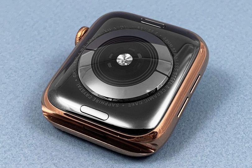
Flip the Apple Watch Series 4 over and you'll notice that the back looks very different from that of previous models.
This time the caseback is made entirely of black ceramic and sapphire. Technical advantages and new sensors aside, it just looks very cool.
I half expect the optical heart rate sensor to glow red and for the watch to start singing "Daisy"" to me out of the speaker on the left side of the case (which is 50% louder, FYI) before jettisoning me into deep space.
The rings around that sensor are the new electrical heart rate sensors, which will be use to perform Electrocardiograms once that feature rolls out later this fall. Apple says that the new materials aren't just aesthetic though – they're supposed to improve cellular and wi-fi connectivity, since the ceramic won't block the antennae. I didn't run any strict tests here, but during my week with the watch I didn't have a single issue, so I guess it's working just fine.
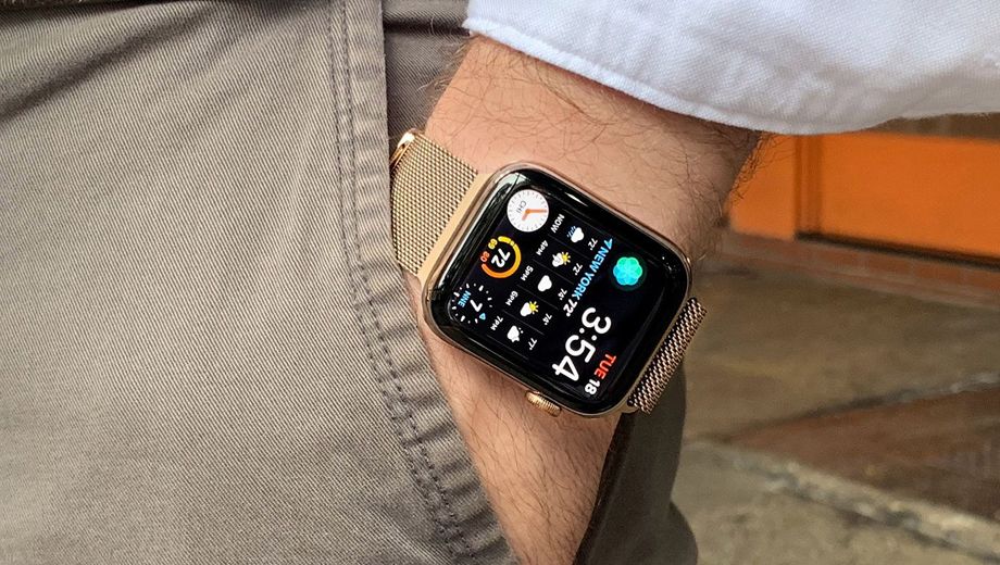
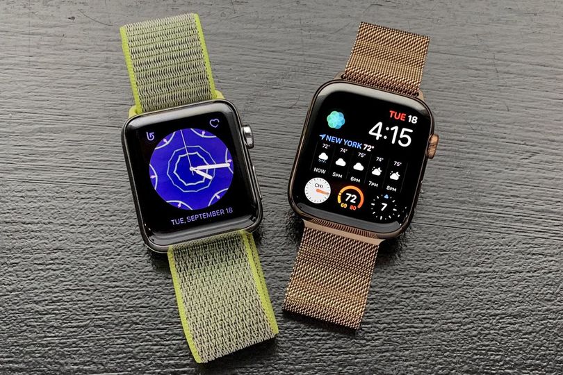
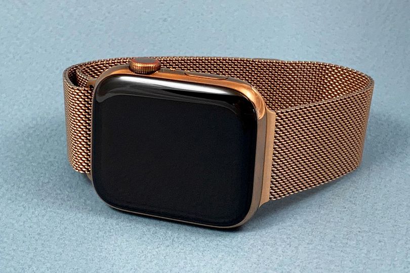
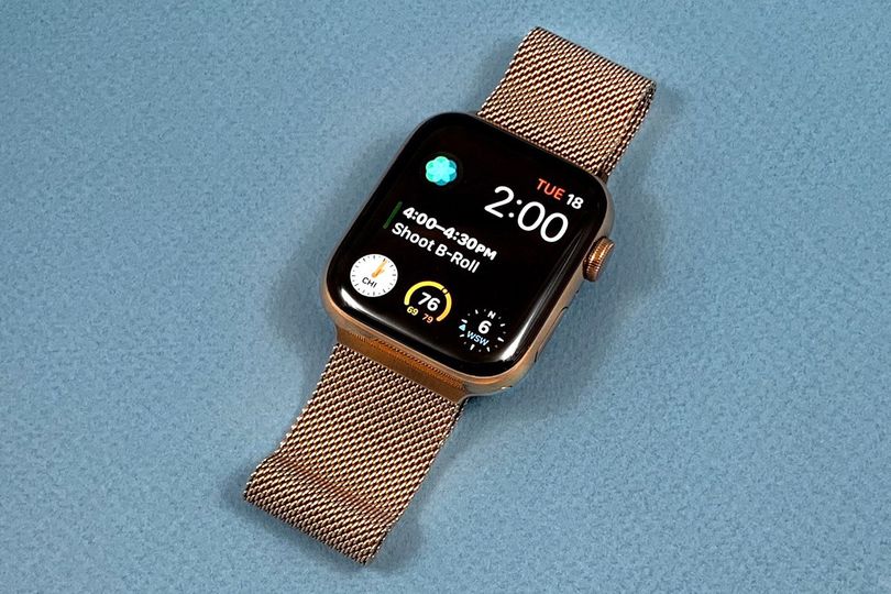
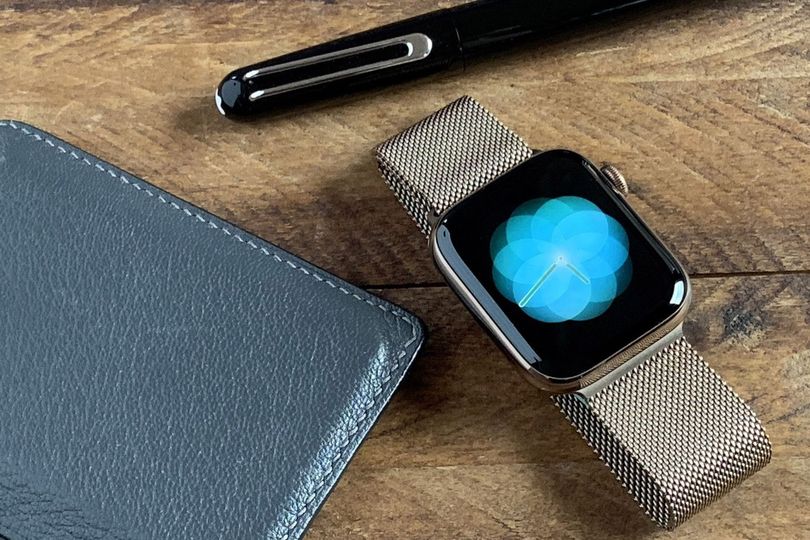
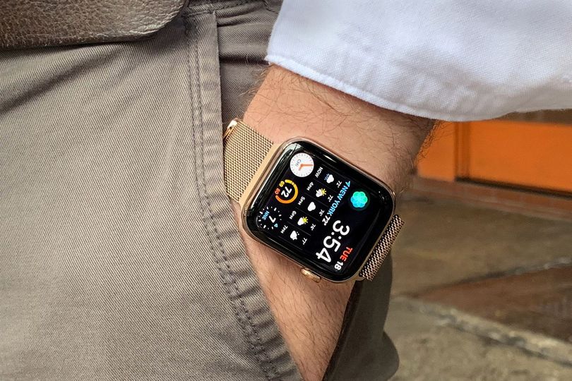
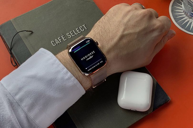
The Apple Watch 4 comes in two materials, aluminum and stainless steel, with each available in a number of finishes that correspond to this year's crop of iPhones. The watch I've been wearing is a 44mm stainless steel model in the new polished gold stainless steel finish.
The number one question I've been getting from colleagues and friends this week is, "Wait, is that solid gold?" and no, it's just gold colored.
There have previously been solid gold watches and aluminum watches anodized to a soft gold color, but never something with this combination of shine, heft, and affordability.
There's definitely something a little luxe here and the particular shade of gold is a little warm and a little soft at the same time – it reminds me of A. Lange & Söhne's Honey Gold and Chanel's Beige Gold a little, though it's not quite as pale as either.
It's worth noting that there is no Edition model of the Series 4, so no full ceramic or solid gold models this year. I really wish there was a grey ceramic option, but I think I'll find a way to survive without one.
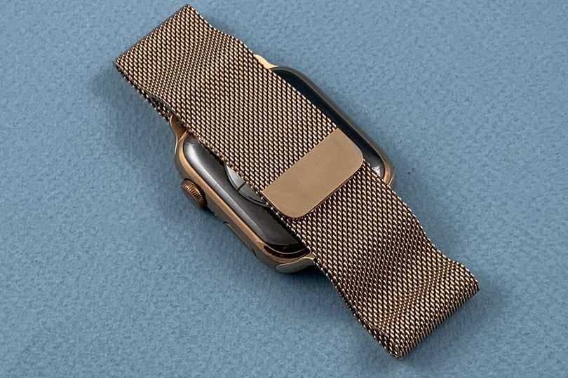
Luckily, the gold Series 4 comes on the perfect watch band, Apple's Milanese Loop in a matching gold finish. You can get it without this band for us$100 less, but you'd be doing things super wrong if you did.
The Milanese Loop has been my favorite Apple Watch band since I first put one on back in 2014 and nothing has changed there. It's comfortable, it's infinitely adjustable, and it looks incredible.
The lugs sit perfectly in the case, giving the whole package a proto-1970s, fully integrated look, and the mesh is just shiny enough without being outright flashy. In gold, it's all that and more. I'd describe it as a bit rakish, and in the best way possible.
New faces and features in WatchOS 5
The moment you push that flush side button and the abyss-like screen flashes on, you'll find yourself in WatchOS 5.
This upgrade is also available to existing Apple Watch owners, but there are a handful of features exclusive to the Series 4 that take advantage of the new hardware.
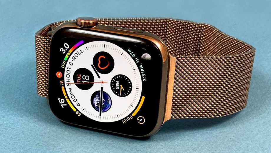
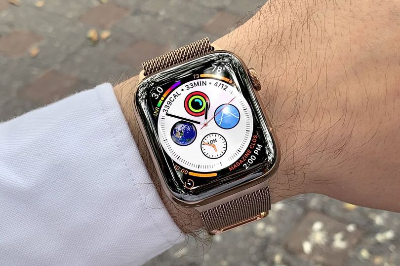
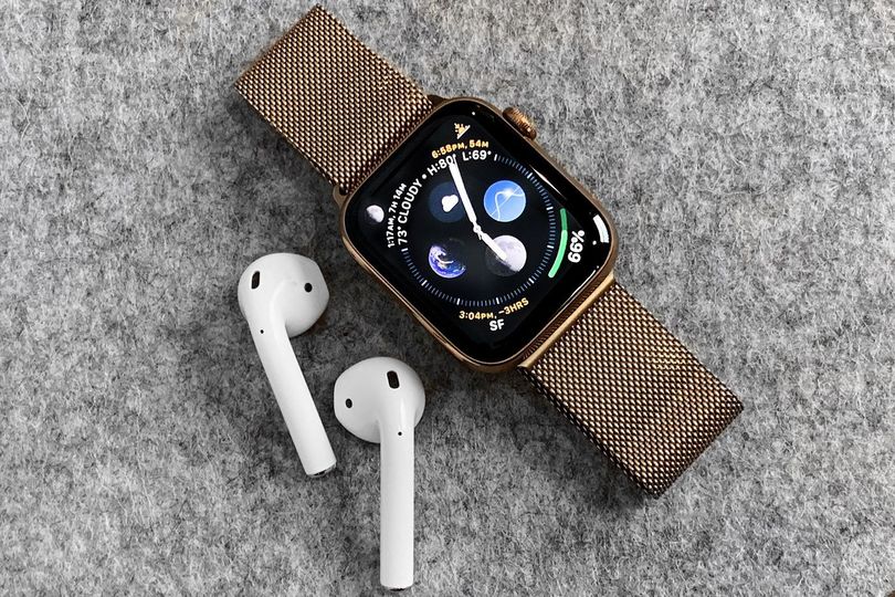
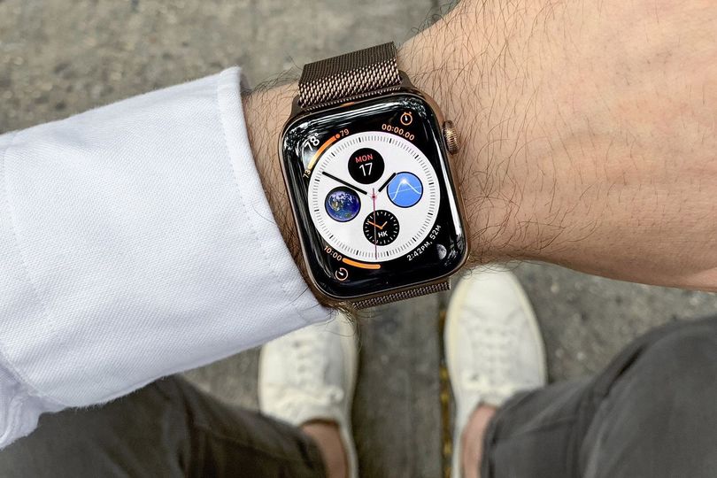
Chief among them is the so-called Infograph face. This face is designed to take full advantage of that new display, and on the 44mm watch you really see it. The information almost feels like it's exploding out from the center of the dial and might escape if you're not careful.
The Infograph gives you space for eight complications on a single dial, with one of them being a little special. At each corner you can place what we'll call a "rich" complication, which gives you a little more information than previous complications did.
My two favorites are the temperature, which now gives you the day's high and low in addition to the current temperature, and the moonphase indicator, which also gives you the time of moonrise at your current location.
At the center of the dial, nested inside the main time display, you get three more basic complications at three, six, and nine o'clock, and then at 12 o'clock you can place a complication that gives you an extra line of information that swoops across the top of the dial.
For this spot, I found myself using the calendar the most, though the activity complication also works nicely, showing your individual metrics all in one spot.
There's another variation on this face called the Infograph Modular. It's a more digitally-styled option with the same goal of packing in as much dense information as possible onto a single screen.
Here you get the same rich complications lined up along the bottom, as well as a special complication spot that takes up the entire width of the dial.
Apple has opened this to third-party developers too, so over the coming weeks there should be tons of options out there for you to choose from. Things like flight information, calendar details, and even extended weather reports are particularly well-suited to the additional real estate.
To me, the Infograph Modular feels closest to the idea of a "personal dashboard," which is something that's been spoken about since the early days of the Apple Watch. I think this one is going to be extremely popular, and I could see those who use the Apple Watch for productivity enjoying it in particular.
The minimal look
But I'll be totally honest here: Both of these new faces, no matter how elegantly they're designed (and they are), just have too much info for me.
I'm someone who keeps his mobile notifications to a minimum, preferring to check in on things when it suits my schedule rather than having to triage a constant barrage of dings and pop-up banners. If it's not mission-critical, I don't turn it on.
So my personal favorite faces are actually some of the most pared-back options available in watchOS 5. These have names like Liquid Metal, Vapor, and Fire/Water. The Apple team used high-speed photography and practical effects to capture these – they're not renders – and they look unbelievable.
Each time you raise your wrist you get a small show and the time. That's it. There's something calming about them and I found them distracting in a good way – it's like carrying a moment of zen around with you all day.
There are versions of these available for Series 2 and 3 watches, but you don't get the incredible full-screen experience unless you've got the Series 4. Sorry.
Heath and fitness come to the fore
Ultimately though, the most important new features have to do with health and fitness. This is clearly where Apple is investing the most energy with the Apple Watch and it's there where the company seems to think it can make the biggest impact.
In addition to the aforementioned ECG feature that's coming, the Series 4 and watchOS 5 include notifications for low heartbeat, irregular heartbeat detection, and slip and fall detection. I'm happy to say that I didn't experience any of these notifications during my week with the Series 4.
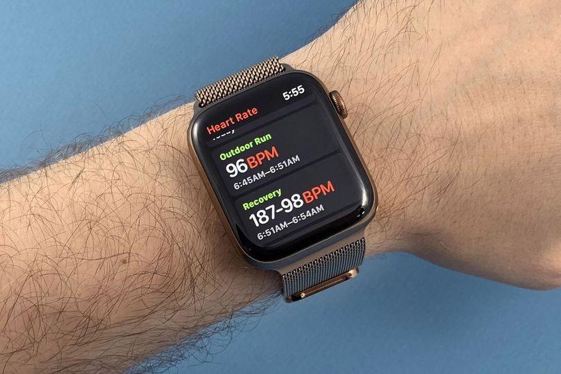
There are some new workouts in Apple's Workout app, including yoga and hiking, that use new algorithms and existing sensors to give you more precise readouts on those activities. Importantly, there's also auto-detect for workouts, so if you start running and forget to start the app, you can do it retroactively. This is one of those features that's ignorable until it's not and then it's just what you always wanted.
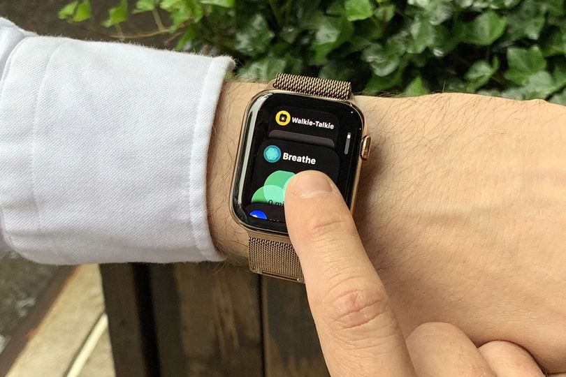
As far as watch faces go, there's a new Breathe face that brings the popular slow breathing app right to your main time display. It's not the pure volume of features that's important here, but rather their centrality to Apple's vision of how one is supposed to use the Apple Watch.
There are a handful of other new watchOS 5 features, such as Walkie Talkie (which lets you send short audio messages back and forth in real time) and the ability to challenge your friends to Activity Competitions, but with just 48 hours between the launch of watchOS 5 and this story running, getting enough friends onboard to really experiment with these wasn't in the cards.
The new raise-and-speak Siri works just fine, though it didn't really encourage me to use Siri any more than I already do (read: hardly ever).
A week on the wrist
Having followed the Apple Watch story since the very first rumors surfaced though to last week's event, covering basically every release and software update in between, I like to think that I know the Apple Watch pretty well.
But putting a new model on for the first time always requires a bit of an adjustment period. Finding the right apps, dialing in the perfect notification settings, and getting all your watch faces set up is a work in progress.
I jumped right into the deep end on day one and set up the Infograph and Infograph Modular faces, forcing myself to use them instead of my more comfortable Explorer default.
For the first day or two, as I'd raise my wrist and the display would flick on, I would almost want to jump back, confronted by the sheer volume of information staring back at me.
The display isn't actually any brighter or more pixel dense, but the size of it plays tricks on your eyes and make everything look at little, well, more. There's that word again.
By the third or fourth day though, I had settled into the new experience, using quick-access timers to keep my pasta al dente and checking multiple time zone displays to perfectly time calls to colleagues in Switzerland.
Despite my preference for minimalism, there's something to be said for having so much well-organized data available at a glance.
One of my favorite new watchOS 5 features is, without question, the support for the Podcast app. This is one of those features that you've probably always assumed was there – unless you went to search for it and came up empty handed and disappointed, that is.
Apple's pitching it as part of the fitness sell, suggesting that it gives you new opportunities for listening to things while you work out.
That's very true, and I know my wife, who is currently training for a marathon, is very thankful for the update, but I think being able to enjoy a leisurely listen over lunch or on the Subway without having to fiddle with my phone is every bit as nice.
That said, it is ultimately the fitness applications that have me loving the Apple Watch Series 4. I've been running with both the Nike Run Club app and the running function in Apple's Workout app, and they each have their benefits.
The former is a bit more bare bones and provides better training programs, while the latter now offers a super in-depth look at how you're actually doing out there on the road. I think I'll likely keep using both going forward, taking advantage of each when it makes the most sense.
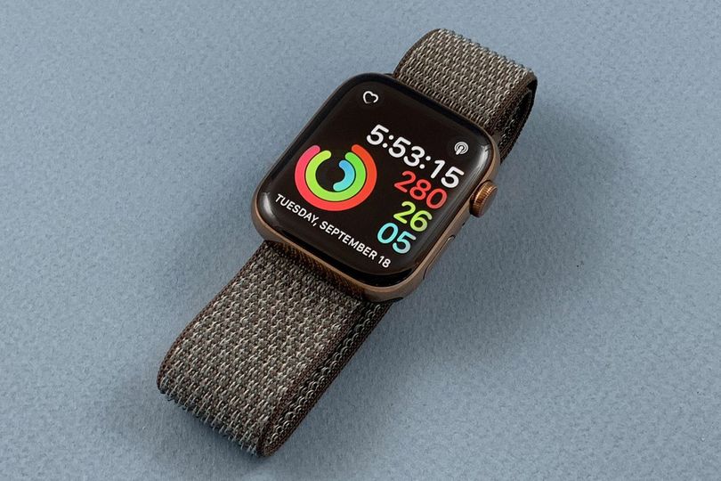
The gamifying of fitness is nothing new, but closing those darn activity rings is just so much fun and I am looking forward to challenging friends sometime soon.
Beyond new features and new faces, there's another important upgrade hidden in the Series 4: the new S4 chip. This watch is blazing fast.
The original Apple Watch suffered from speed problems and even the Series 3 could get a little sluggish at time. With the Series 4, I've had no problems. Zero. The watch is snappy and responsive, doing exactly what I need when I need it.
It's hard to overstate how big a difference this makes in overall user experience. Staring down at your wrist, tapping your toes and grimacing is not something anyone wants to be doing when they just want to know if it's going to rain or not.
The big questions
All of this leads us to two big questions. Firstly, should I buy an Apple Watch Series 4? And secondly, is the Series 4 really going to convince me to set aside my mechanical watches?
We'll start with the first question. The short answer is "maybe." With last year's Series 3 introducing cellular to the mix, we got a much more obvious reason to say "yes," but that doesn't mean there aren't good reasons to buy a Series 4.
If you have a heart condition or want more ways to monitor your health in general, definitely pick out a Series 4 model for yourself.
If you find yourself wanting more information at a glance and aren't yet satisfied with what your existing Apple Watch (assuming you have one) can do, you're going to get a lot more out of the Series 4 and it's probably worth the investment.
If you find the idea of the Apple Watch exciting but find your current model to be a little too slow, the under-the-hood improvement themselves should justify an upgrade.
Maybe most importantly though, if you've never owned an Apple Watch and have found yourself wondering whether or not it could be a good fit for your life, the Series 4 makes a really compelling case for giving it a shot.
This feels like the first iteration on Apple's fully thought through Apple Watch archetype, defined by those three principles outlined at the beginning of last week's keynote (and referenced at the beginning of this story).
It's cohesive, it's ambitious, and it might just encourage you to reshape your habits and behaviors for the better.
If you still haven't given the Apple Watch a shot and you've been waiting for the right moment, this is that moment. Go for it.
Now, what are you to do about the perennial dilemma facing Apple Watch-curious watch folks? Will you want to trade in your mechanical watches for an Apple Watch? No, you won't.
But I do think it's worth adding an Apple Watch to your rotation if you don't already have one. I'm not one for working out with mechanical watches on, so right there I've got an opening in my life for an Apple Watch.
There are also days where it's good to have a little extra info at hand and leaving that vintage sports watch in its box at home for a few hours isn't the worst thing in the world.
From there, I think you'll likely learn a bit about your connection to watches too. What is it that you miss and what is it that you don't miss about your more traditional timepieces? What does the Apple Watch bring to your life that your mechanical watches can't?
These are all good questions and I know plenty of watch collectors who enjoy rotating an Apple Watch in with their other watches. The days of watch lovers dismissing the Apple Watch are long gone and at this point it feels almost like a must-have for anyone truly interested in timepieces more generally.
A machine for living with
Le Corbusier famously called the house "a machine for living in" (Une maison est une machine-à-habiter, for those of you who want to check the French), referring to the idea that a house is merely a tool that we use to help us live our daily lives.
A good house, Corb suggests, is a house that makes regular tasks and activities easier and more pleasurable. What Apple is creating with the Apple Watch is a machine for living with. The Apple Watch is a device that sits right on your body, accompanying you throughout your day, ostensibly making your daily routine a bit easier and more enjoyable in the process.
The Apple Watch Series 4 has been designed from its most basic elements to facilitate three things: connectivity, activity, and wellness. If we think about what 21st-century life looks like for many of us, these are three of the most important areas of our day-to-day lives.
The Watch is a companion on your morning run, keeping your training program on track; it guides you through your day, keeping you on time and aware of what's going on; it helps you get to dinner on time and to keep your iPhone in your bag during that date; it tracks your activity silently and chimes in if it notices anything that should cause concern.
At its best, it provides a sense of comfort and reliability without getting in the way quite as much as a smartphone might. And at its worst, it's merely another screen offering you information you could probably find somewhere else. It seems like the risk/reward balance is starting to tip pretty strongly in one direction.
Now, I want to make it abundantly clear here: I am not saying that you absolutely need an Apple Watch. You don't. You can live a healthy, active, productive life without an Apple Watch. People have been doing it for quite a while.
But with the Series 4, Apple is making a case for the future of the Apple Watch. Maybe I'm being naive in some way, but based on the current trajectory of the Apple Watch and the stated goals for the category, it looks to me like we're no more than a few years away from it being almost a necessity.
The argument for wearing anything else on your wrist is getting tougher to make each year, and this year is no exception. What does that mean for you mechanical watches in the long term, you might wonder? To be honest, I'm not sure, but we'll cross that bridge when we come to it and we've still got a way to go.
For now though, the Apple Watch Series 4 truly is, as Apple is fond of saying, the best Apple Watch yet.
It's a mature expression of what the Apple Watch can be, taking the next steps on the path set out by Apple over the last four years and showing us early glimpses of where it might go in the future.
So whether you're someone still wandering around with a naked wrist, checking the time by pulling out your phones like it's a new-age pocket watch, or a die-hard watch collector who can't imagine giving up their mechanical marvels, I think it's high time you give the Apple Watch a shot.
The Apple Watch Series 4 is available now, 21. Prices start at A$599 and the watch you see in this review sells for $1,199. Current Apple Watch owners can upgrade to WatchOS 5 now.






Qantas - Qantas Frequent Flyer
04 Nov 2011
Total posts 359
All well and good, however probably worth mentioning that the ECG feature won’t be enabled on watches sold in Australia.
13 Feb 2015
Total posts 70
Technically the ECG feature isn't available anywhere...yet.
06 Jul 2016
Total posts 8
The lack of an always-on display is the real deal breaker for me. My series 3 watch fails to flick on when I raise my wrist almost half the time. And that leaves aside all the times when I just look at my wrist to check the time and I have to tap on the display in order to bring it to life. It is annoying, and means that the Apple Watch fails to provide the most basic functionality of a watch. I realise this is a battery issue, but other smart watches (ugly ones) seem to be able to do this. Perhaps series 5, and that will be a worthy upgrade.
Hi Guest, join in the discussion on Review: one week wearing the new Apple Watch 4