Review, photos: Virgin Atlantic's new Upper Class Dream Suite
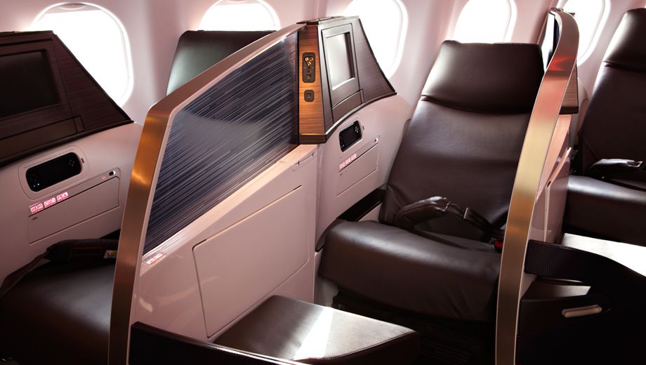
Virgin Atlantic's second-generation Upper Class Dream Suite is an exciting evolution of its existing fully flat bed business class with new seats, an updated cabin and a unique 'staggered herringbone' layout for the centre seats.
The new seats and cabin configuration have had business travellers sitting up and taking notice, so Virgin Atlantic invited Australian Business Traveller to give it a 'flight test' on its daily service from London to New York.
The Upper Class Dream Suite cabin
Virgin Atlantic calls its new seat the Upper Class Dream Suite, to distinguish it from the Upper Class Suite you'll find on most routes today (including its Sydney-Hong Kong-London flights).
You can get a feel for the dramatic redesign of materials and colours by comparing this to the current Upper Class, as seen below with some bloke who apparently flies a lot on Virgin Atlantic.
The Dream Suite is rolling out first on the London-New York JFK route, with London-Mumbai (which restarts later this year) next on the list. All of Virgin Atlantic's new Airbus A330 planes will have the seat on board, as will the Boeing 787 Dreamliners due to arrive from late 2014.
Virgin Atlantic's seat guru Martin Barnes tells us that plans haven't yet been put in place for the Airbus A380 superjumbos that the airline has on order, while the Airbus A340-600 planes (as seen on Sydney-Hong Kong-London flights) won't be retrofitted with the new seats.
First impressions: chic, modern, elegant
The first thing you notice when walking on board Virgin Atlantic's A330 is the bar at the rear of the Upper Class cabin.
This is now more self-contained than the fully open bar of the current Upper Class cabins, with seating for three and some leaning area (with little "perches" where you can park yourself) on the back wall.
Airlines are starting to re-think the first impression they give when you board their planes -- especially in business class, and Virgin has done a really good job of snazzing up what would otherwise be a humdrum galley kitchen area where harried crewmembers pull out industrial metal boxes to find a glass for your 'welcome' drink.
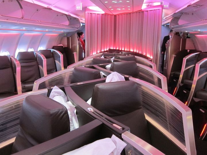
Turning left at the bar and moving into the cabin proper, you can't fail to spot the unique "staggered herringbone" layout.
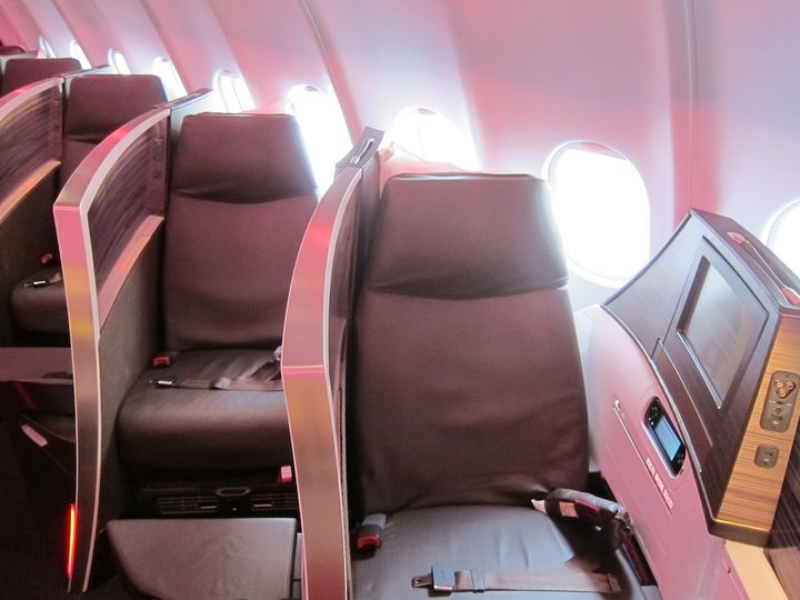
The window seats haven't changed but the centre seats are dovetailed together, interwoven in a kind of zig-zag pattern.
(Our visual guide will get you to speed on the different types of business class layouts)
There are a few downsides to the new layout: the centre seats are markedly shorter than the window seats, by 16 centimetres -- just over six inches.
That means that the advertised 7 feet, 3 inches bed is a bit of an advertising fib unless you're in a window seat.
That 7'3" measurement is also from the very tip of the ottoman to the very point of the head space -- not all of which is usable space unless you have a very pointy head.
The space has, however, been cleverly shaped in a sort of helix pattern to create extra space.
At 6'2" (188cm), I'm pretty tall, and I was able to curl up fairly comfortably in the middle seat, though not stretch out entirely.
The window seats are also spaced four inches further away from each other than the centre in terms of seat pitch -- and while that's not the be all and end all of personal space, it's a factor that makes the middle seats less desirable than the window seats.
And there's no more of the extra privacy gained from the 1-1-1 layout, which meant that the window seat that the centre seat wasn't facing was less overlooked.
The Upper Class Dream Suite seat itself
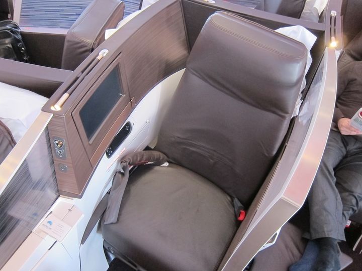
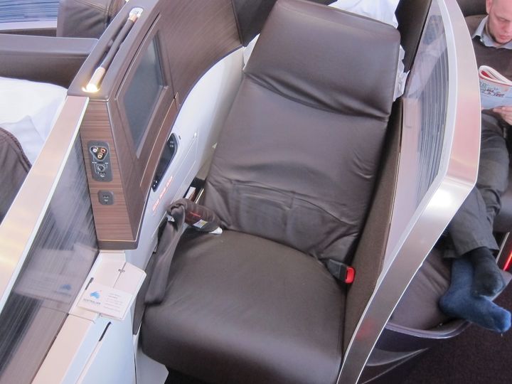
A key change to the look and feel of the cabin is the helix-shaped sculpting of the the divider between seats.
The old seat used to be a vertical white plastic curved wall, with your space defined by the vertical nature of the dividers.
There's a decent amount of extra personal space -- especially at the shoulders, elbows and hips -- that's been carved out by the angling of the divider walls in a sort of sculptured wave pattern. It may seem like a minor stylistic thing, but it's a big improvement in terms of elbow-room.
The new seat, however, has a semi-transparent barrier. (Virgin calls it opaque, but it's not -- it's translucent plastic with a sort of filigree pattern that masks detail.)
On first glance, the translucent part looks as if it might be a minus in the privacy column, and it is to an extent, but it's made up for by the impressive amount of extra spaciousness it gives. This is no 'coffin class' -- it's airy and spacious.
Virgin's decision to do away with an overhead bin section in the centre section means there's plenty of headroom -- but there's also no personal air vent for the centre seats.
The extra room also comes at the expense of having to share a bin with the person in the window seat -- and these are small Airbus bins, not the big Boeing Sky Interior ones.
You won't fit two roll-on suitcases in the bins that are supposed to be for two passengers. And as you can see, my relatively small bag had to be jammed in sideways.
This is likely to pose a significant issue for the business class cabin.
Whenever bin-sharing is necessary, there's always some petty tyrant who thinks that the bin above their seat is "their" bin, so it's a good job that the crew are happy to hang jackets and coats -- and this will become increasingly important in the northern hemisphere winters.
Compared with the A340-600 Upper Class suite that we see from Australia, the 1.5 inches of extra seat width over the old seat is surprisingly noticeable.
It's now 24.4 inches wide at seat-level, but with much more space thanks to the sculpting. If you're familiar with the Boeing 747-400 Upper Class seat (which is wider than the A340 version), the difference won't be as noticeable.
The supposed extra 50 percent travel in recline mode isn't noticeable, however. The big downside to the old seat on daytime flights was the fact that it didn't recline to a Z-bed configuration for relaxing, watching a movie or reading a book.
The Dream Suite doesn't recline much further back than the older seat, which is a real missed trick for day flights.
I found that the most comfortable position for relaxing was actually to put the seat into bed mode and prop myself up with the duvet roll and pillow behind me.
But in recline mode the business class offerings from Qantas, British Airways, Cathay Pacific and many other airlines are superior.
Changes that you might miss revolve mainly around the ottoman: it's smaller and more angular than the old version.
If you lift up the ottoman seat, there's a small in-flight only storage area underneath.
There's also no seatbelt to use it as a meeting area or for companion dining -- not that we saw a lot of people ever doing that, in fairness -- but Virgin Atlantic's seat designer tells us that it's a matter of making a few changes (from magnetic to mechanical latch) for regulator certification and then the seatbelts will return.
The Upper Class Dream Suite in fully flat bed mode
The Dream Suite still goes fully flat by folding over so you can sleep on the back. That's in contrast to other herringbone layouts like Delta, Air Canada and Cathay Pacific's old business class.
For night flights, to put the Dream Suite into bed mode Virgin has taken out the motor from the old seat in favour of a spring-latch system. Now, you press a button and the mechanism unlatches from seating position, and then you push it over into bed mode.
Once you're horizontal, things are greatly improved, with a lengthened fully flat sleeping platform that now stretches to 7 feet 3 inches (that's 88 inches or 220cm) for window seats, but only 204cm for the centre pairs. So if you're tall, book yourself a window seat.
The back of the seat -- which makes up your bed -- is a lot softer than it used to be.
That's thanks to a revolutionary change, where there's no hard surface under the foam in bed mode. Instead, it's a series of bands that create a much more supportive, nearly sprung-like feeling.
The entertainment monitor is all new too, with an entirely new system called JAM and larger, 12.1-inch screens.
You can also control it using the touch-sensitive remote, which is actually more annoying than useful if you're tall -- it's exactly at elbow height.
There's a fairly wide selection of music, TV shows and games, but classical music fans will be disappointed by the selection, which is mostly banal popera schlock.
If something from your laptop, tablet or smartphone sounds like a better option, you're covered, though, with a sensibly located power point between your legs, two USB sockets that either power a device or read files from a USB device, and one of those round iPod-compatible sockets for playing a movie from your iPhone or iPad on the in-seat system.
And, sensibly, these have been put high on the wall within a cord's-length of the small fold-down cocktail table, where you can stow your phone while it's playing.
Annoyingly, the noise-cancelling headphones are subject to interference from the onboard Aeromobile cellular phone systems. The dit-dit-dit that you might remember unshielded speakers repeating from the days of 2G mobile phones is particularly distracting and went on through the flight.
We'll be putting together a full version of our popular Best Seats guides to help you pick the best seats for the new Dream Suite on the A330, but the long and the short of it is that we'd pick 3A, 3K, 4A or 4K as the best of the lot.
What's your take on Virgin Atlantic's new Upper Class Dream Suite seats and cabin? Sound out in the comments area below or join the conversation on Twitter: we're @AusBT.
For the very latest news for business travellers and frequent flyers, tune into @AusBT on Twitter.






Virgin Australia - Velocity Rewards
05 Jan 2012
Total posts 335
Great Review! Thats about the best way to put it - some bloke who apparently flys a lot on Virgin Atlantic!
04 Nov 2010
Total posts 670
Another top review, AusBT. And as always not afraid to reveal the shortcomings, unlike so many junket stories. Sounds to me like the window seats are the best to go for, you get the longest bed and also first claim to the overhead bins!
06 May 2012
Total posts 8
Hello John, great review! I was wondering if you are planning to do a review on EVA's new buisness class. The seat looks like a variation of CX's seat. EVA, with the debut of its new seat, might be a good alternative travelling to NA. Thanks
24 Oct 2011
Total posts 159
great review of the new seats.
you know i didnt actually notice they have changed the layout to 2-2-2 until you pointed it out.
very clever VS, *slow clap* for creating an extra seat per row in the new "dream suite".
15 Apr 2011
Total posts 580
You didn't notice, because they didn't change the layout to 2-2-2...
24 Oct 2011
Total posts 159
ahh sorry i meant 1-2-1
it was previously 1-1-1
15 Apr 2011
Total posts 580
Very nice. It's a shame that they won't be flying this product to Sydney - I would have been tempted to try it out to HKG sometime given the broader improvements they seem to have been making this year.
Maybe down the track once the 787's are here...
05 Jun 2011
Total posts 38
Looks to be a fantastic product. I think they have done a better job with the 'rethink' and 'redesign' of this seat than NZ did with their version a couple of years back with the 77W. Interesting that NZ ditched the brown leather, calling it dated, while Virgin Altantic adopted what looks to be a deep dark brownish leather due to being 'in vogue'. NZ tried to brighten up the cabin with the white seats etc, but I think that virgin did a better job with those translucent dividers.... 2 quite different approaches to a similar product. On a different note, I would expect NZ to adopt this interlocked method of 1-2-1 layout with the narrower 789 cabin....
Hi Guest, join in the discussion on Review, photos: Virgin Atlantic's new Upper Class Dream Suite