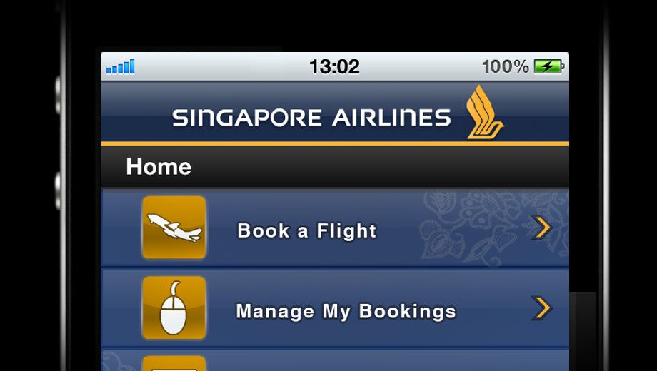
Singapore Airlines has joined the increasing list of airlines with iPhone apps. The new app, which also works on the iPad and iPod Touch, will allow travellers to check flight schedules, book flights, select seats, check in and manage their KrisFlyer frequent flyer accounts.
After spending some time with the app, it's useful for KrisFlyer members, but it quickly becomes obvious that the app could use some serious improvement. It's slow, many of the functions don't work as well as they could, and it doesn't really bring the iPhone user interface feel.
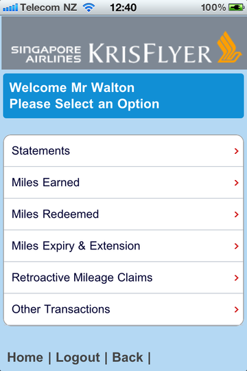
Members of the KrisFlyer frequent traveller programme will get the most out of the app, since they're able to quickly and easily check their mileage account.
However, the app does require members to log in with the ten-digit KrisFlyer membership number and six-digit PIN every time the app is launched.
Now, the downsides. First, it's unclear why the airline insists on a mobile number just to launch. That seems a little Big Brother, and there's no information about how the airline will use your mobile, nor any option to opt out of marketing information.
The flight schedule check spent a good fifteen seconds on the "loading" screen, and then ended up just being a link to an old-style WAP webpage: frustrating.
The user interface itself is odd and doesn't feel like an iPhone app, with a strange flipping animation between pages following several seconds of lag on the "loading" screen. You'll see the loading screen a lot while using the app.
The booking system has some oddities. Entering the date for your flights, for example, is done by typing on the keyboard rather than using the date tumbler that most apps use.
Frequent Singapore Airlines travellers know that the airline's seats vary widely between aircraft, especially in business class, where the same aircraft are fitted with fully flat beds or old-style recliners.
So it's a mistake that the booking function of the app omits any information on the type of plane used until the final Itinerary Confirmation page.
The way the app displays available fares across dates could also use some user interface work. It's not especially helpful or intuitive.
But the app's most serious flaw is its lack of support for multitasking. If you're making a booking and navigate away from the app (to change the song you're listening to, or to take a call), the app relaunches completely and you have to start all over again at the main screen.
Apple specifically created the multitasking ability for apps to switch seamlessly from active to background and then bring users right back to where they were. It's a real frustration that the app doesn't use that ability.
The boarding pass function is also clearly ahead of the airline's own systems -- all you can do with the 2D bar code is present it to the check-in agent along with your passport to pick up a paper boarding pass. Other airline apps use the barcode instead of a paper boarding pass, which is a much better implementation.
Overall: useful if you're a Singapore Airlines KrisFlyer member, but give it a miss if you're not a member.


Hi Guest, join in the discussion on Reviewed: Singapore Airlines iPhone app