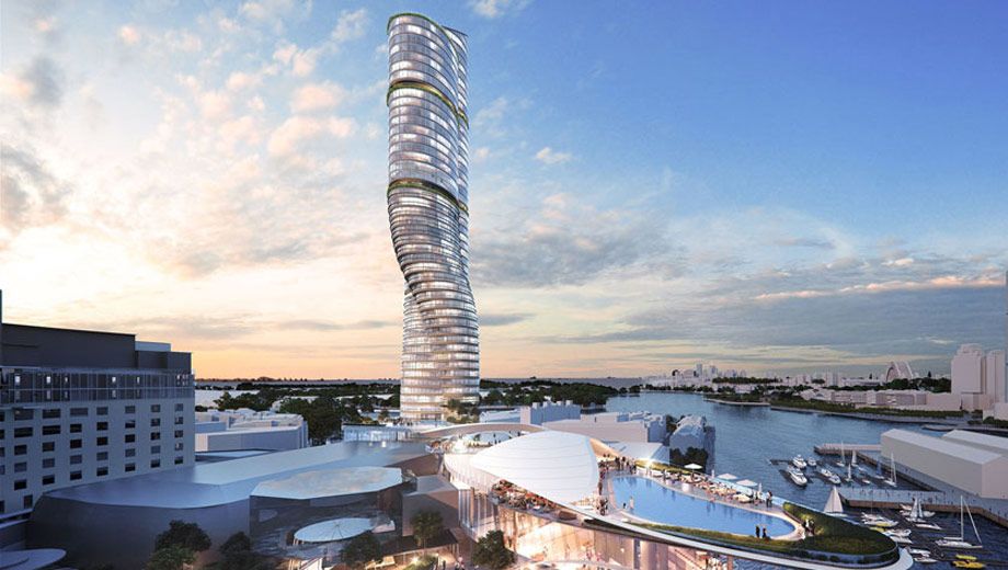
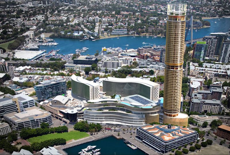
Sydney's new Ritz-Carlton Hotel will soar above The Star casino and entertainment complex at Pyrmont when it opens by 2021 – and it'll take the shape of one of these three towers, shortlisted as finalists in a $500 million design competition.
The six-star hotel Ritz-Carlton Sydney hotel will contain 220 rooms with panoramic views over Darling Harbour and beyond, along with events spaces, conference facilities and a ballroom.
The 215 metre tower will also be home to 150 upscale residences.
Here's the first design from global architects Grimshaw, which merges skyscraper with silo:
Up next: an angular multi-faceted edifice from BVN.
The most dramatic tower of the trio is FJMT's spiral twist, which some have already suggested looks like an askew stack of silver Star casino gaming chips.
"The international calibre and local credentials of our architects will ensure that The Star can showcase its home-grown Sydney character in world-leading ways that befit our city’s global status," says Matt Bekier, CEO of The Star Entertainment Group.
“Our development concept will take The Star's room inventory to more than 1,000, bring The Ritz-Carlton brand back to Sydney, and add a further 20 food and beverage venues."


28 Oct 2011
Total posts 645
call me boring, call me whatever you like!, but the Grimshaw design gets my vote. BVNs is too sharp/intense, and FJMTs is too... much!. Sometimes, understated/elegant, yet still a landmark, is better than loud/harsh, and an eyesore. In my opinion Grimshaw just fits better in its surroundings.
13 Sep 2016
Total posts 17
On first impulse I think the FJMT would look great, especially as we see more dramatic new buildings go up around Darling Harbour. I also agree the Grimshaw design is appealing, although to me it looks a little too much like Packer's nearby Barangaroo towers.
04 Jul 2013
Total posts 22
FJMT by far the most dramatic & sleek. It would become a new icon for our city. Looks fantastic!
20 May 2015
Total posts 579
FJMT's version is the best. Plus, it integrates better with The Star's current architecture. The other two designs are too angular.
Qantas - Qantas Frequent Flyer
18 May 2011
Total posts 233
I agree, anything is better than what they already have.
FJMT design reminds me of someone standing with one foot hooked behind the other and about to fall over.
Turkish Airlines - Miles & Smiles
08 Jun 2014
Total posts 262
David, any news on the Ritz in Perth... opening before the Sydney one?
Qatar Airways
07 May 2014
Total posts 6
Australia struggles to offer 5 star service. How will they offer 6 star service?
10 Aug 2015
Total posts 113
Ah Sydney quite some distance from Fountain Lake yet we can clearly hear "Look at me, look at me".
05 Nov 2014
Total posts 6
Have traveled to Australia twice a year for 13+ years. During my time in Australia I had time for significant exposure to the culture of the country, as well as the city of Sydney. These travels also qualifies me as somewhat of a hotel rat so to speak.
18 Dec 2016
Total posts 1
FJMT looks the best out of the three but either keep the spiral going all the way to the top or flip it upside down. Nothing screams Australia though but I guess there's no rules saying it has to
Hi Guest, join in the discussion on Sydney Ritz-Carlton hotel set to soar at The Star