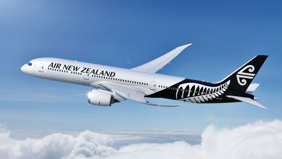
Air New Zealand's fleet is in for a makeover, with bold new livery incorporating the iconic New Zealand 'fernmark' logo.
The new livery will introduced later this year as part of a worldwide NZ$20m (A$16.7m) marketing campaign between Air New Zealand and Tourism New Zealand.
Most aircraft will be dressed to impress in the airline's standard white livery, which will now feature a dramatic black section sweeping up from the rear of the wings, as seen blow in this PR shot showing the Boeing 787-9 Dreamliner due for delivery next year (and which will likely launch on the Auckland-Shanghai route).
However, Air New Zealand will continue to paint a select number of aircraft in a distinctive 'all-black' variant of the new design.
The design process involved extensive consumer testing including focus groups both in New Zealand and overseas, with the airline stating that 78 percent of those surveyed believing the country's familiar 'fernmark' should be incorporated into the airline's new look.
Also read: The world's best-looking aircraft liveries
Follow Australian Business Traveller on Twitter: we're @AusBT


Qantas P1
18 Jan 2012
Total posts 73
Looks awesome!
10 Mar 2011
Total posts 526
Must admit that I like the all black version better than the other one.
24 Oct 2010
Total posts 2563
You're not Robinson Crusoe on that score - it almost makes ou wonder if they should do most of the fleet in all-black and save the white livery for special aircraft (eg 787-9) so that it stands out a bit more.
Qantas - Qantas Frequent Flyer
20 Mar 2012
Total posts 233
Much more interesting than the plain white fuselage that too many airplanes are painted in now!
Qantas - Qantas Frequent Flyer
04 Nov 2011
Total posts 359
They are both striking liveries. Well done Air NZ.
Qantas - Qantas Frequent Flyer
02 Jul 2011
Total posts 1374
Koru and the fern just don't seem to gel together.
Would have been better dump the koru to just with the text, and have the fern sweeping up into the tail...
Apart from that its just another white jet with a coloured tail and plane font...
Also done nothing on the engines. A Maori motif (like new Fiji Air) would look good.
18 Jun 2013
Total posts 2
Even just have the Koru on the engines
10 Jan 2013
Total posts 15
Generally I like where they are headed with this design, but in my opinion is seems clunky and unfinished. They've slapped two motifs at the end of the plane with neither being dominant or gelling with the other.
Why not move the fern elsewhere on the plane and tone down it's domination? (I know this is similar to their previous design). Or, as someone suggested, move the koru next to the name and place the fern on the tail?
18 Jun 2013
Total posts 2
The Koru should be on the engines and the fern can then go further up the tail.
Then over time drop the Koru off the engines and you have then changed your motif without losing your brand
07 Nov 2011
Total posts 11
Beautiful livery - it's a tad sad to be letting go of the teal tones (simply due to nostalgia) but overall, i'm very happy with the direction of the branding.
Nice work NZ!
Emirates Airlines - Skywards
07 Sep 2012
Total posts 146
The Kiwis are sorting themselves out in the graphic design department. Nice new plane livery, and finally got a decent one-day cricket uniform
02 Jan 2013
Total posts 140
You cant tell me Qantas livery and your one day cricket team are the shining light in graphic design......because they are not.
Virgin Australia - Velocity Rewards
30 Apr 2013
Total posts 17
After reading the AusBT lead about 'bold new livery', I expected something good. However, what they've done is a disappointment.
There are now two icons. The original symbol, plus the fern. Corporate logos should only have one symbol. AirNZ should decide which one it wants to be, and get rid of the other.
09 Sep 2012
Total posts 139
Looks rather un-Australian. Is this NZBT?
02 Jan 2013
Total posts 140
Deal with it idiot!
04 Nov 2010
Total posts 670
Longreach, I think it's yourcomment that is un-Australian.
Virgin Australia - Velocity Rewards
18 Jun 2013
Total posts 24
What an awesome livery
03 Sep 2013
Total posts 3
I Like the All Blacks Fern rather the new version that is about to come, you will not have the white back ground behind the new fern. Even better just repaint the 70s Scheme The Big 10s looked great in that (AWESOME).
Hi Guest, join in the discussion on Air New Zealand's new livery revealed