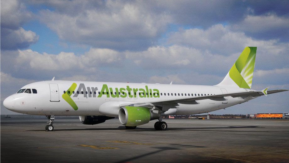
Strategic Airlines is getting a new look to go with the challenger's new 'Air Australia' name.
The fresh lime-and-white livery – accompanied by a boomerang-style flourish in the logo, wingtips and tail – has made its debut on one of Air Australia's Airbus A330s with the rest of the A320 and A330 fleet to follow.
Strategic hopes the eye-catching look will help boost awareness of the airline ahead of a planned mid-December launch of services to the US.
Air Australia will initially run three flights per week from Melbourne and Brisbane to the USA, although due to the use of mid-range A330s, in this instance USA means 'Honolulu', with an onwards connection to the mainland via a US-based partner.
The livery is created by Sean Cummins, who designed the original Virgin Blue colour scheme.
“The challenge was to convey a modern Australian aviation product, for a company with its own heritage and an instant sense of familiarity and like-ability” Cummins explains. “Green is our key colour with a hint of gold and subtle silver-grey representing gum trees, koalas and grey kangaroos."
“The Air Australia symbol is a stylised boomerang, the most striking icon of flight in the Australian lexicon. Because of the company’s strong history as a defence force charter company we have also incorporated the rising sun, also a strong Australian symbol also found on the Australian Army badge.”
Air Australia's Airbus A330-200 planes sport five rows of business class recliner seats in a 2-2-2 configuration.
But with numerous direct flight options from Honolulu to cities in the US and Canada – and a useful 7.30am arrival time into Honolulu's airport for all flights – it's one worth keeping in mind.


10 Mar 2011
Total posts 526
Wow... what a shame they didn't go with a more sophisticated look. That colour scheme and livery just screams "LOW COST AIRLINE!"... just like the Virgin Blue scheme used to.
I think Strategic's original livery is more classy than the new one. I do wonder who advises some airlines on their branding! Sorry... it's just awful!
Qantas - Qantas Frequent Flyer
09 May 2011
Total posts 362
Funny that, considering they are becoming a low cost carrier. Personally I like it. It looks fresh and unique. Definately eye catching.
10 Mar 2011
Total posts 526
You can be a LCC without looking like one though. Fresh and unique is true.. but I can't say I'd look at it and think "Must fly with them".
24 Oct 2010
Total posts 2563
That's an interesting observation: is ANY livery a major driver? (Apart from an old or ugly livery steering you away from the airline).
10 Mar 2011
Total posts 526
I don't know if they are a major driver, but certainly a livery on a plane can at least give a positive first impression. It would be no different to any other kind of branding.... You see something that branded well and it leaves a positive impression.
The Air Australia livery reminds me of Viva Macau or the like where I just think it looks cheap and nasty so wouldn't give a second consideration to flying with them.
Look at the difference with Virgin - The all red planes look nasty, but the clean lines of the white with red looks much classier.
03 Jan 2011
Total posts 665
The green reminds me of Russian airline S7 -- the former Sibir -- which Landor rebranded when I was being a tech monkey in their office way too many years ago. And they're a member of oneworld... I'm still not convinced by the green.
24 Oct 2010
Total posts 2563
All I will say is that as much as I appreciate the white-and-lime colour scheme, through no fault of its own it persists in making me think "Lime fresh!" (see https://www.youtube.com/watch?v=bALQpDMmL3c if you don't share this memory of '70s Australia).
Hi Guest, join in the discussion on Fresh new look for new 'Air Australia' airline